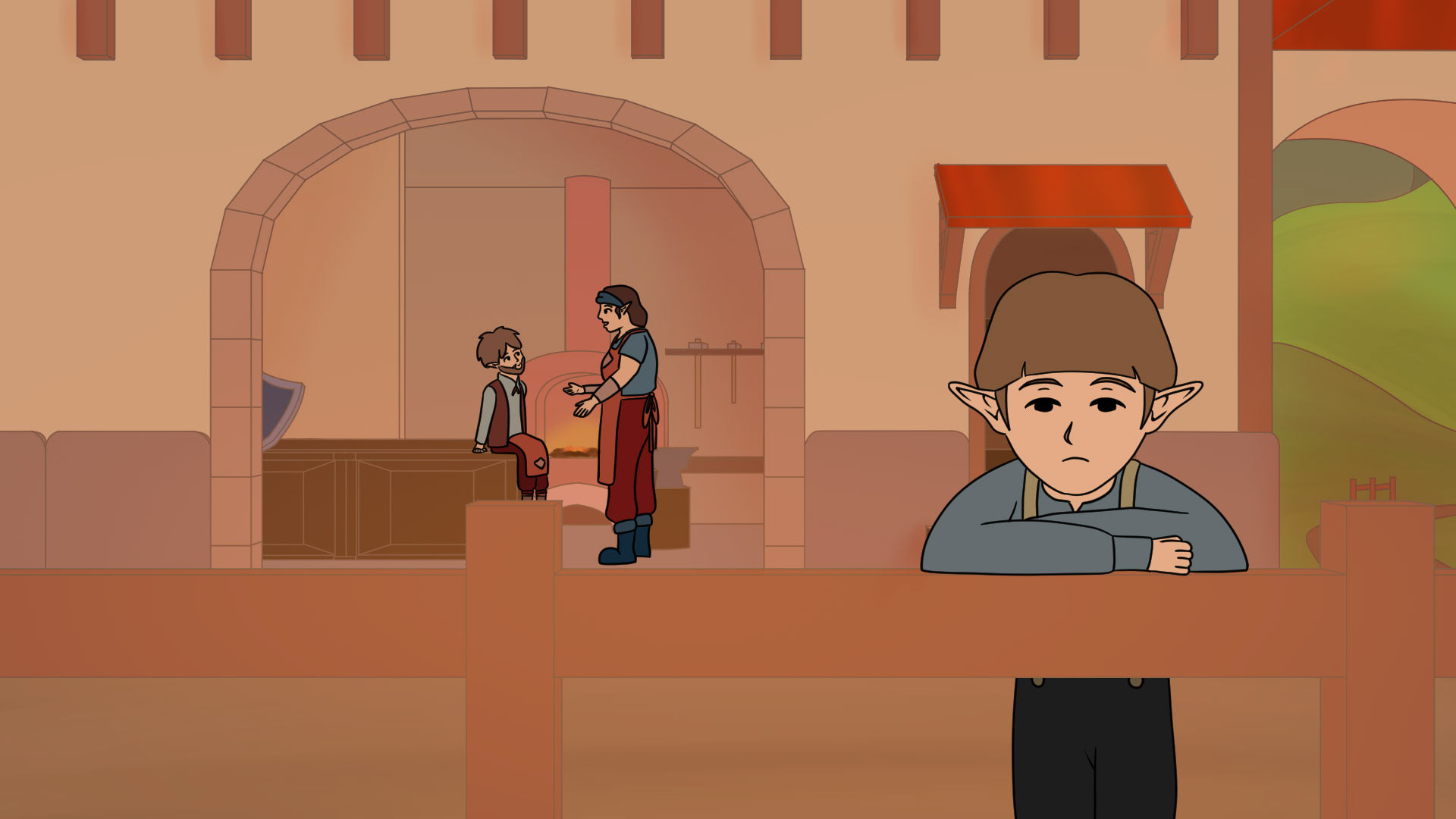
The Life of an overlooked NPC is an animation about a small kid who lives in a little village in a world of a Video Game. He really wants to help the heroine but has nothing to offer accept a broken flute. Because of that he tries to become someone else and disguises himself as different typical NPC roles. Can he win the attention of the heroine?
NPCs are such an important and mostly overlooked part of video games. But especially NPCs fill these worlds with life no matter how big or small their influence on the story or the gameplay is. Therefore i wanted to honor them with this animation.
The Life of an overlooked NPC
[Clip Studio Paint/After Effects | Master Semester 04 | 2025]
[Clip Studio Paint/After Effects | Master Semester 04 | 2025]
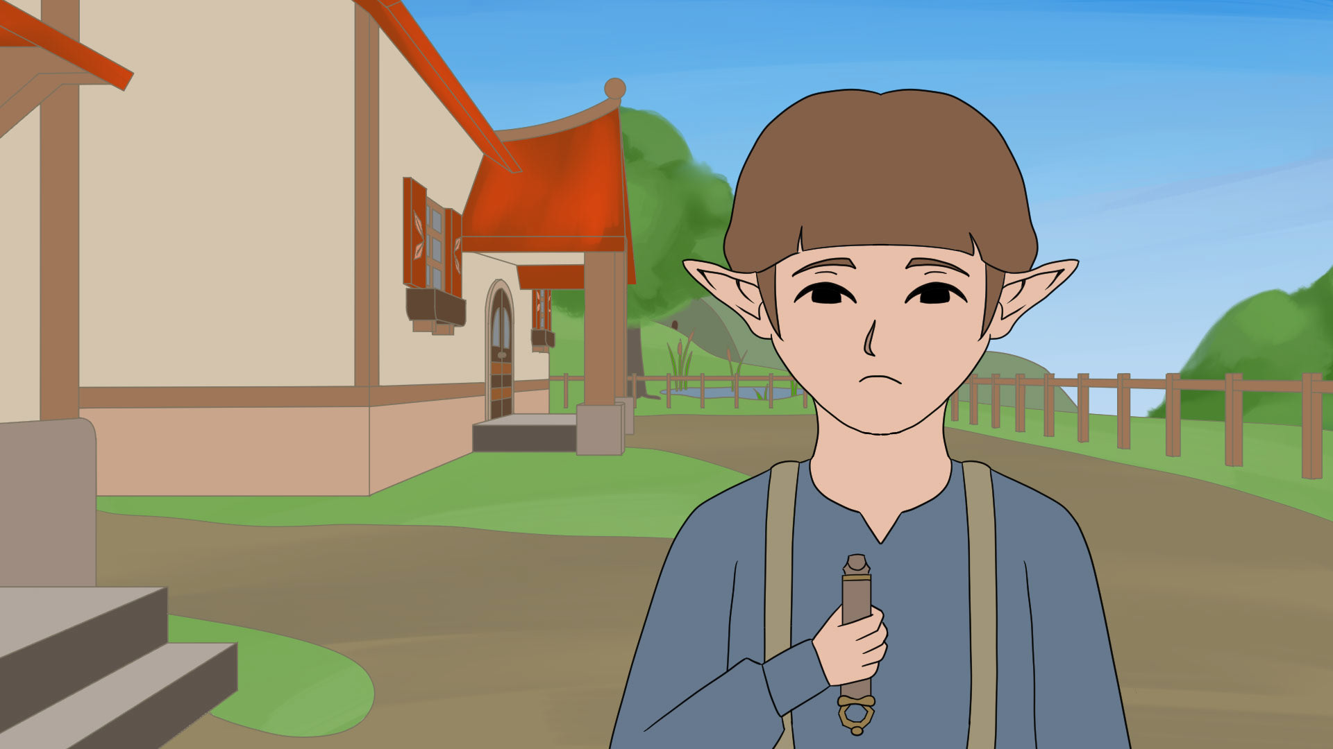
NPC
[Clip Studio Paint | Master Semester 02/03/04 | 2024/2025]
[Clip Studio Paint | Master Semester 02/03/04 | 2024/2025]
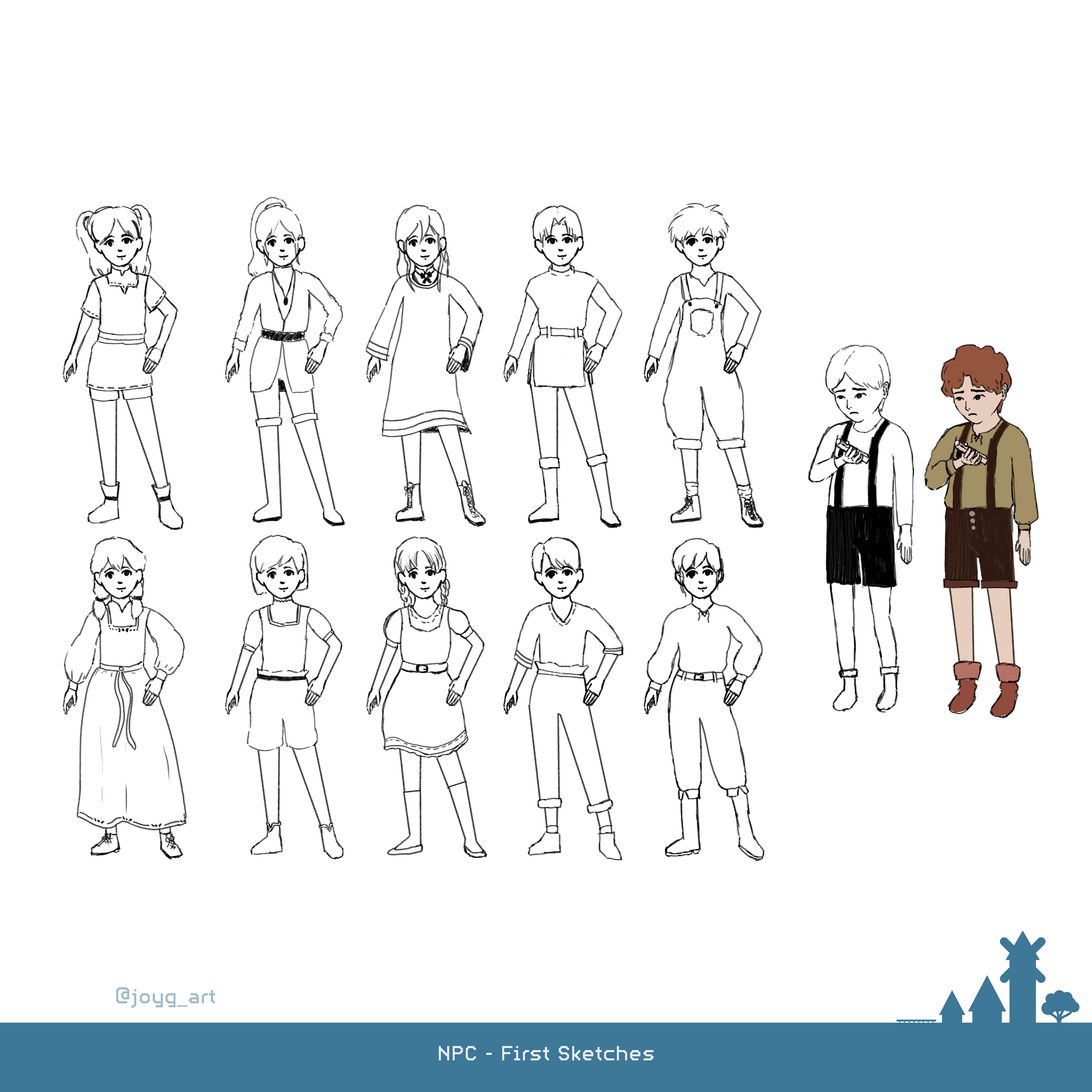
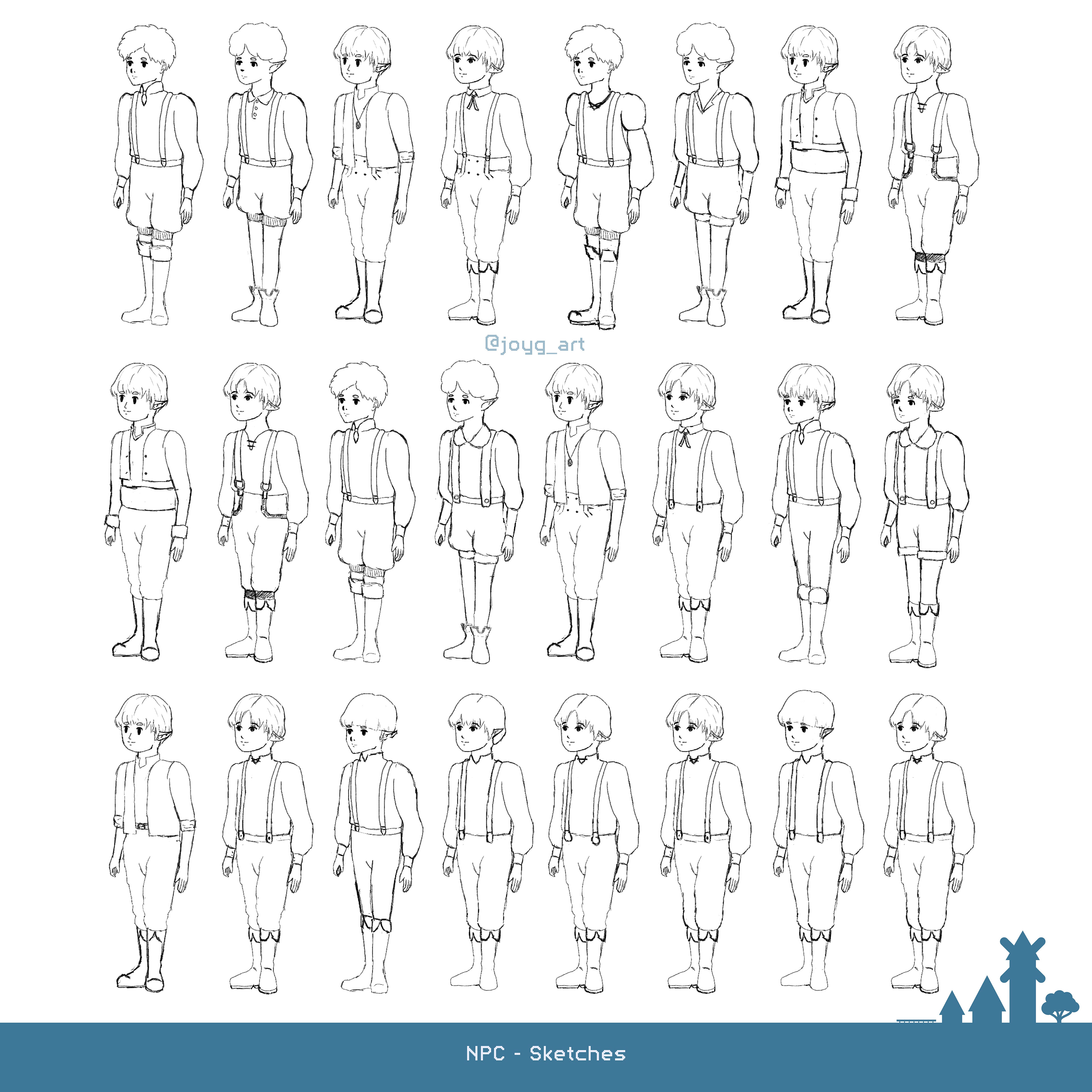
After working mainly on the story in the first Semester I only made some Sketches for the NPC. At this Point it wasn't clear if the character should be a boy or a girl.
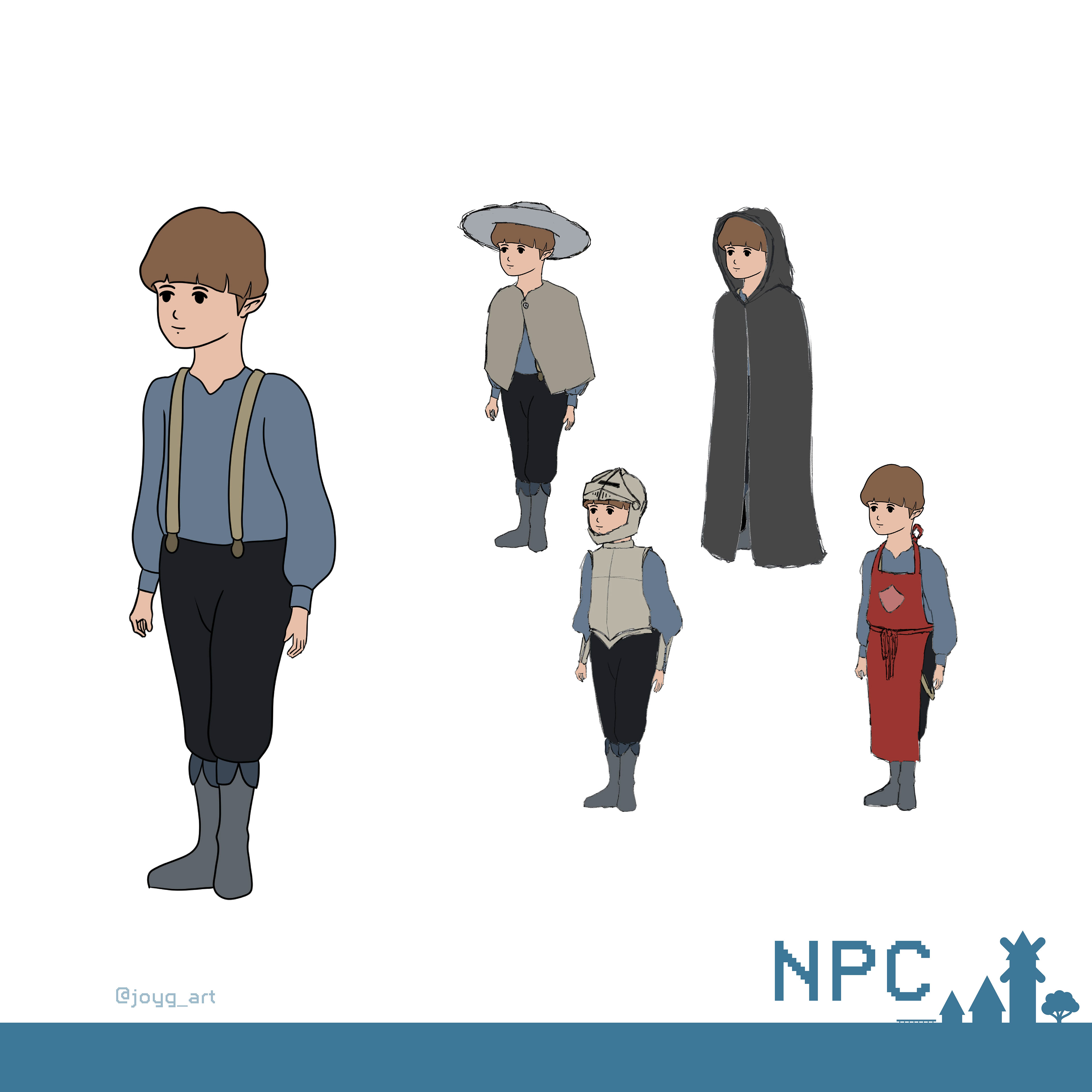
In the next Semester it was decided that the NPC should be a boy!
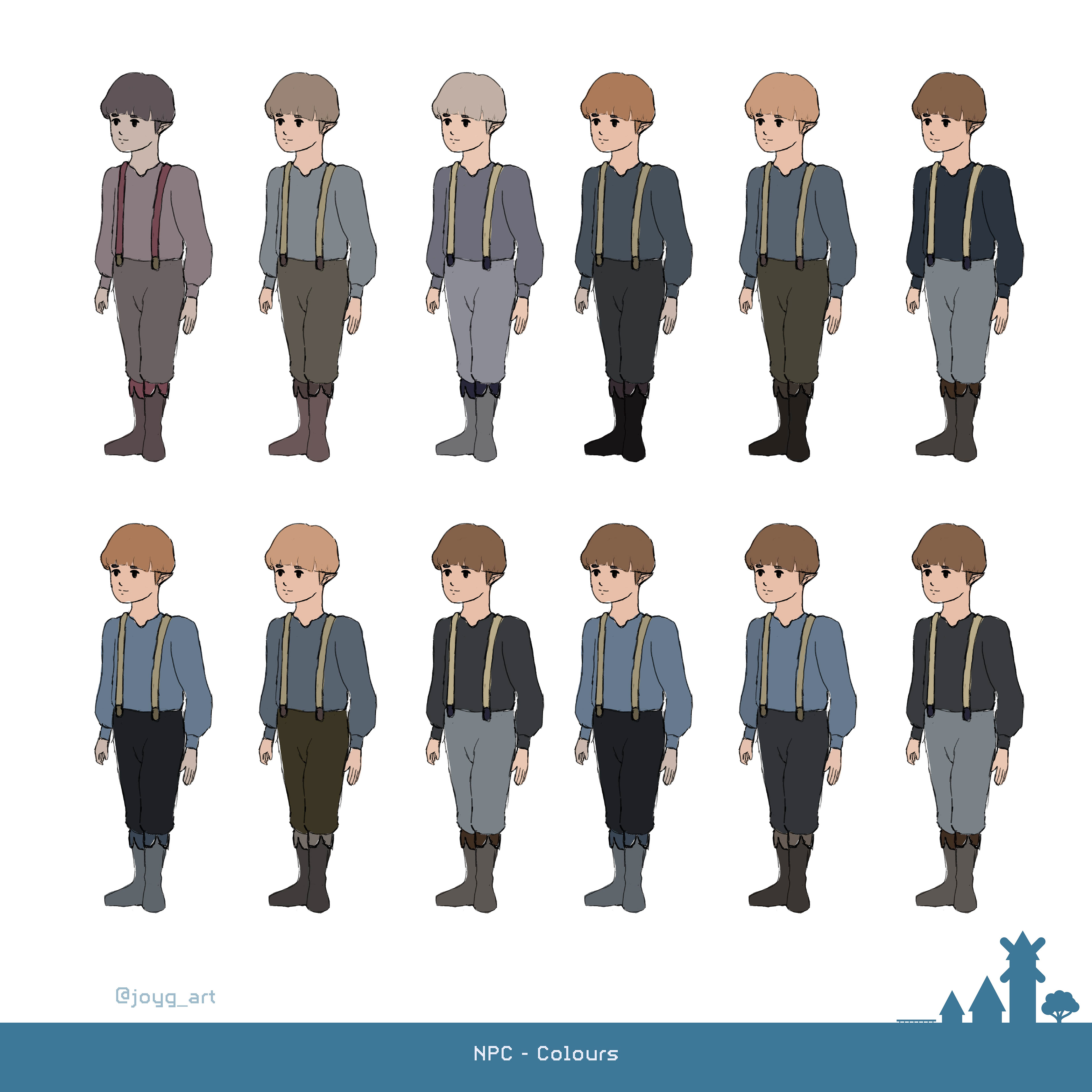
His colours were choosen in relation to the Heroine. They should both have similiar colours but the colours of the NPC should look more greyish to support his invisibility.
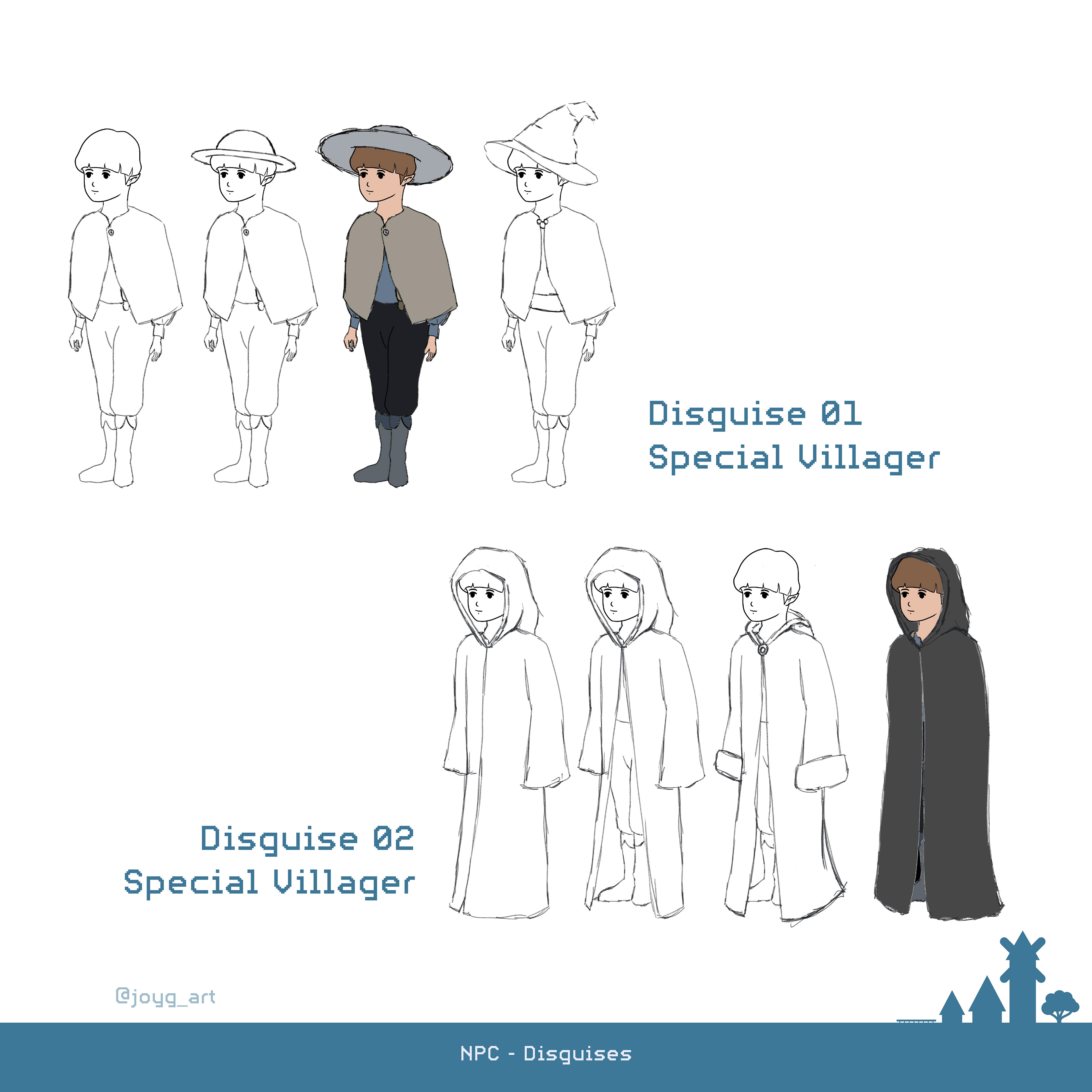
In the course of the story the NPC tries to be someone different and disguises himself as important NPC Roles. First he starts with Roles that are normal but look more interesting.
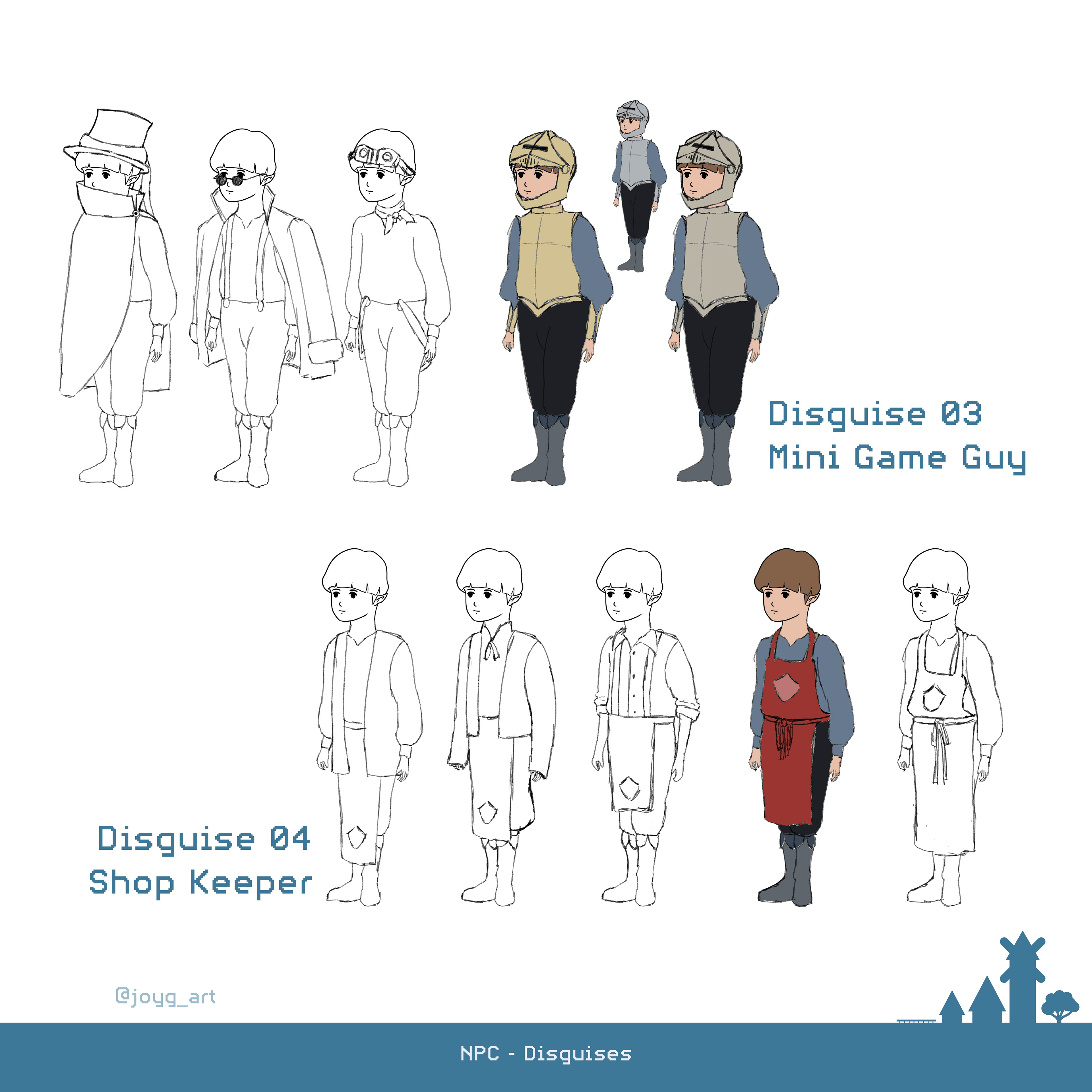
Later he also adapts Roles like a Mini Game Guy or a Shop Keeper.
Hero
[Clip Studio Paint | Master Semester 03/04 | 2024/2025]
[Clip Studio Paint | Master Semester 03/04 | 2024/2025]
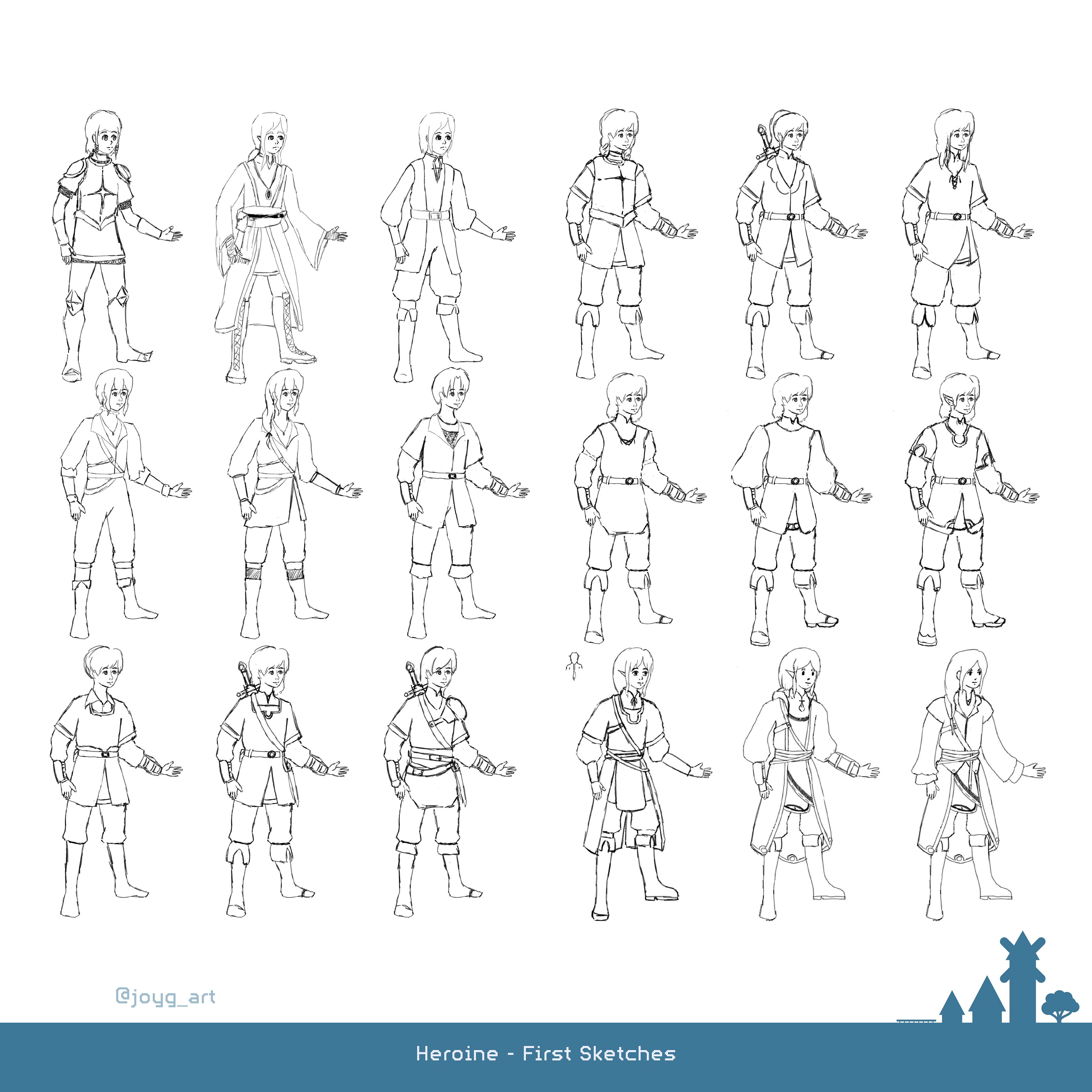
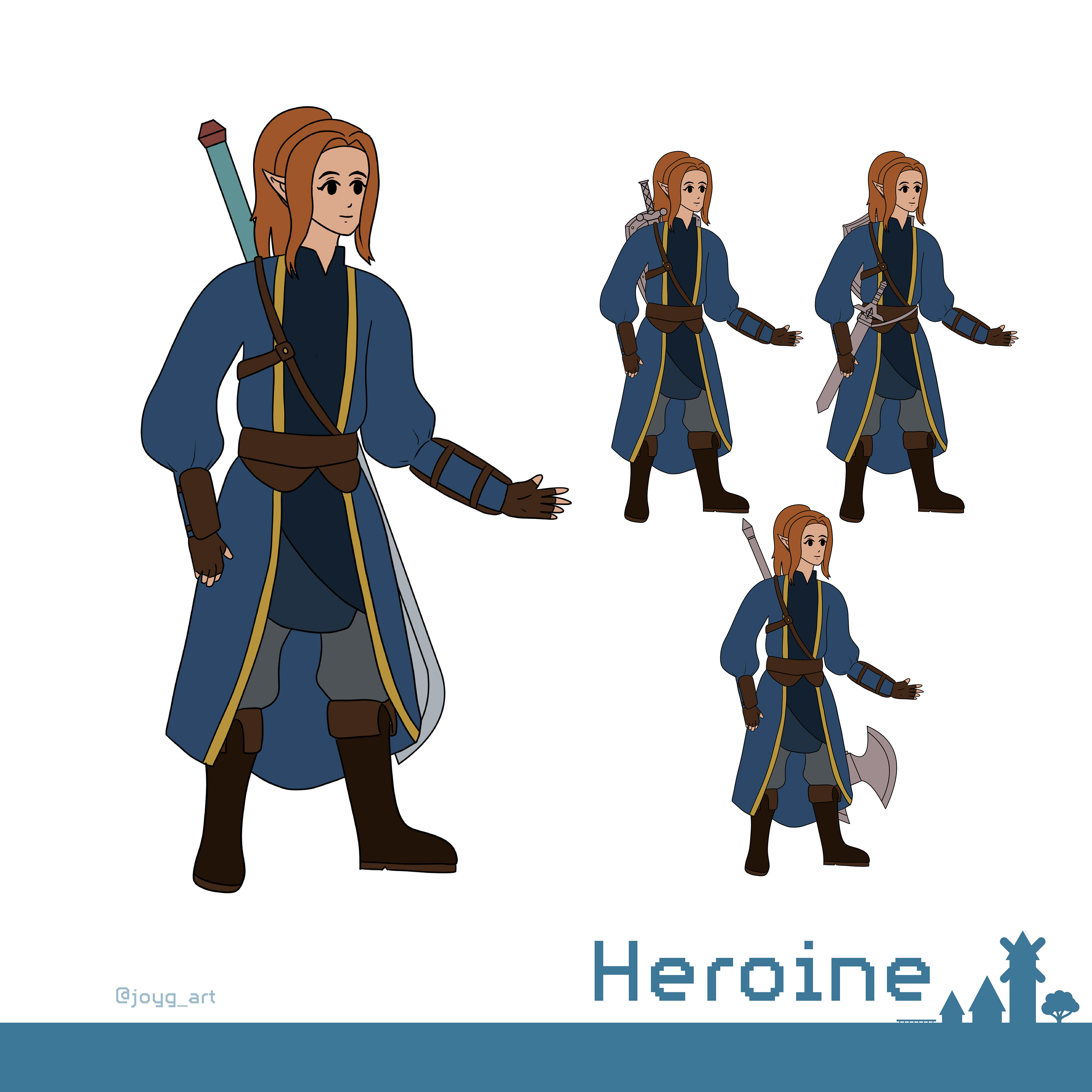
At the start the hero should have a genderfluid look to better represent the various players.
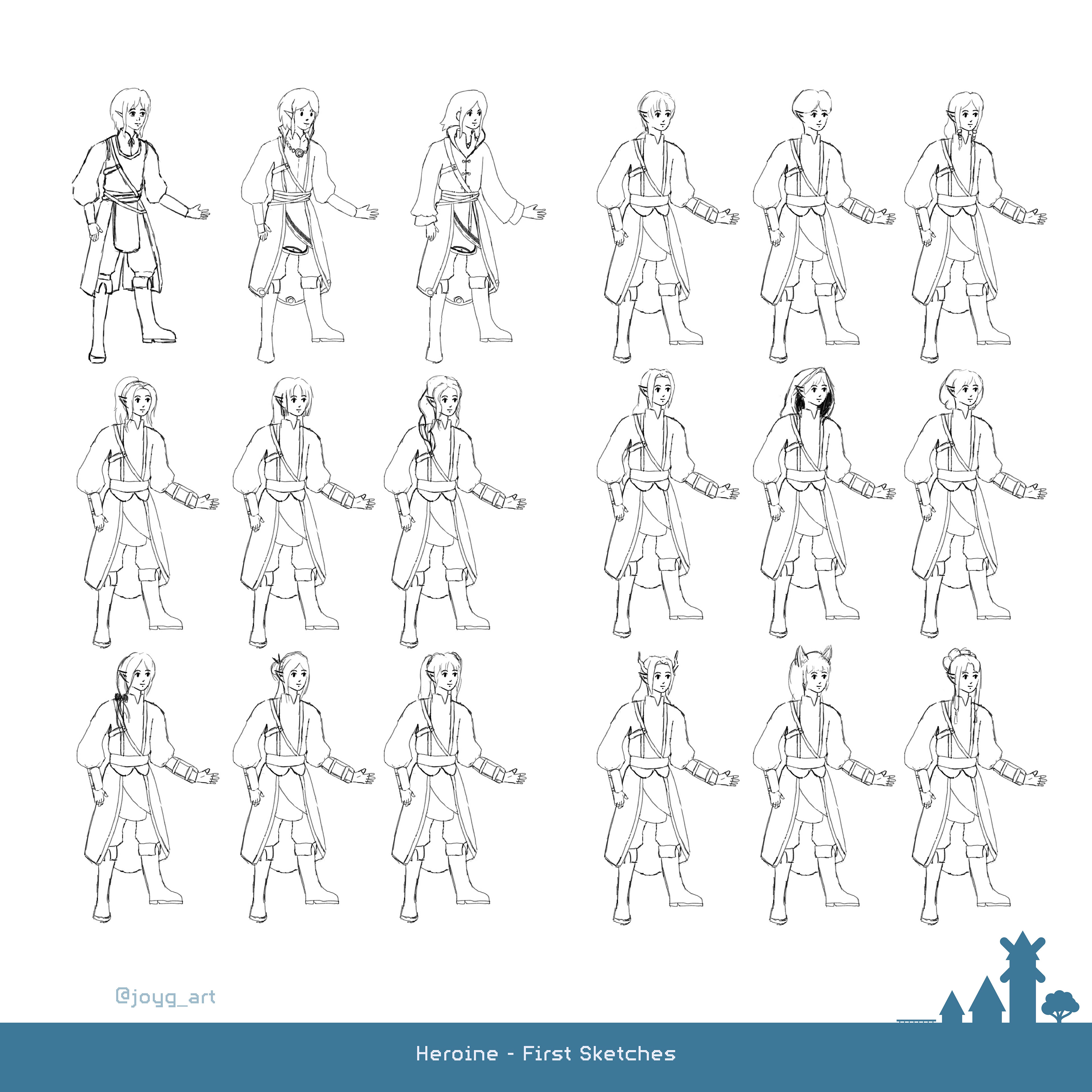
To keep everything balanced after the NPC became a boy it was decided that the hero was going to be a heroine. Because of that it was possible to experiment a little bit more with female hairstyles. Nevertheless I tried not to lose the genderfluid attributes to much.
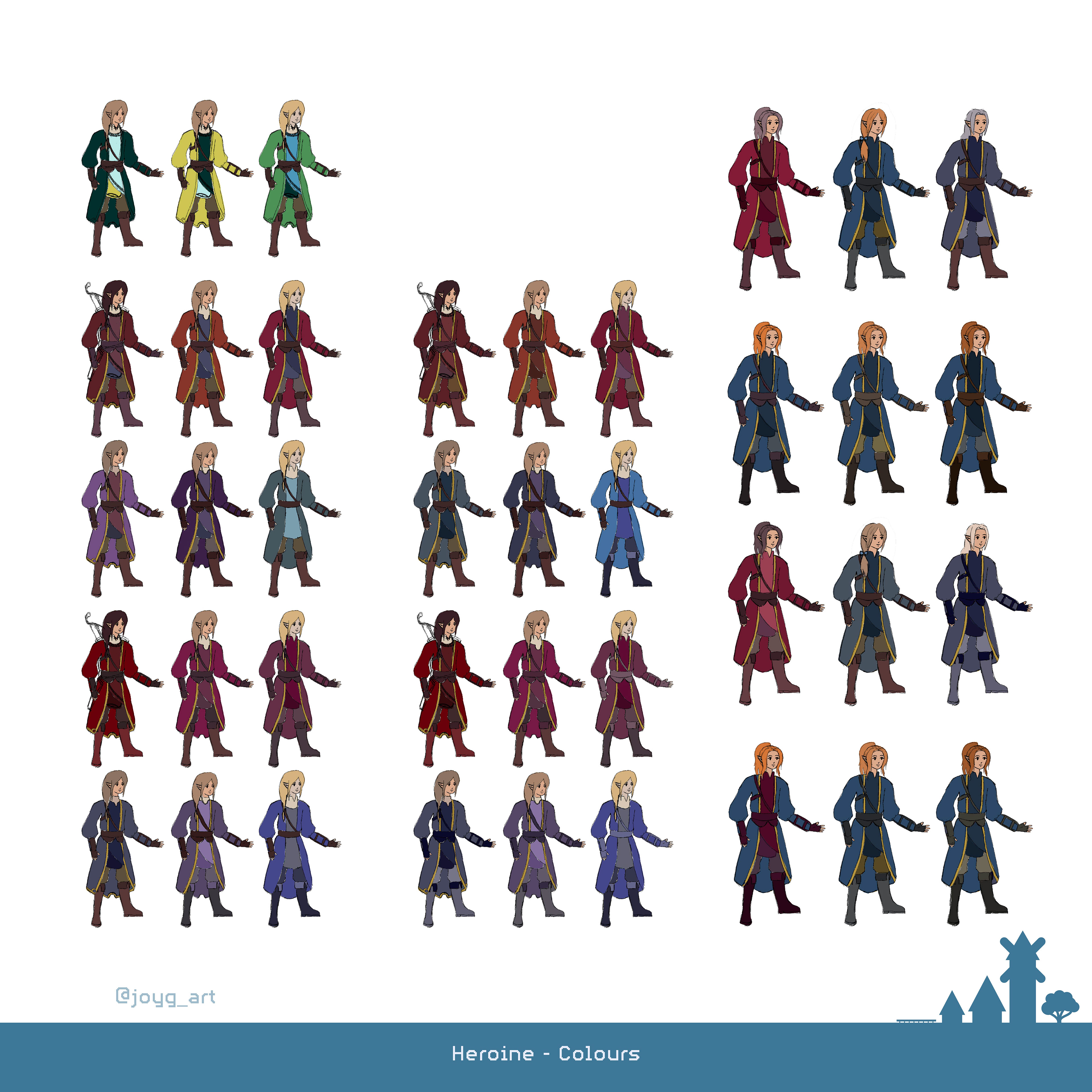
I tried to use noble colours to empathize a special and important appereance. Moreover they should work with the more overlooked NPC.
Parents
[Clip Studio Paint | Master Semester 03/04 | 2024/2025]
[Clip Studio Paint | Master Semester 03/04 | 2024/2025]
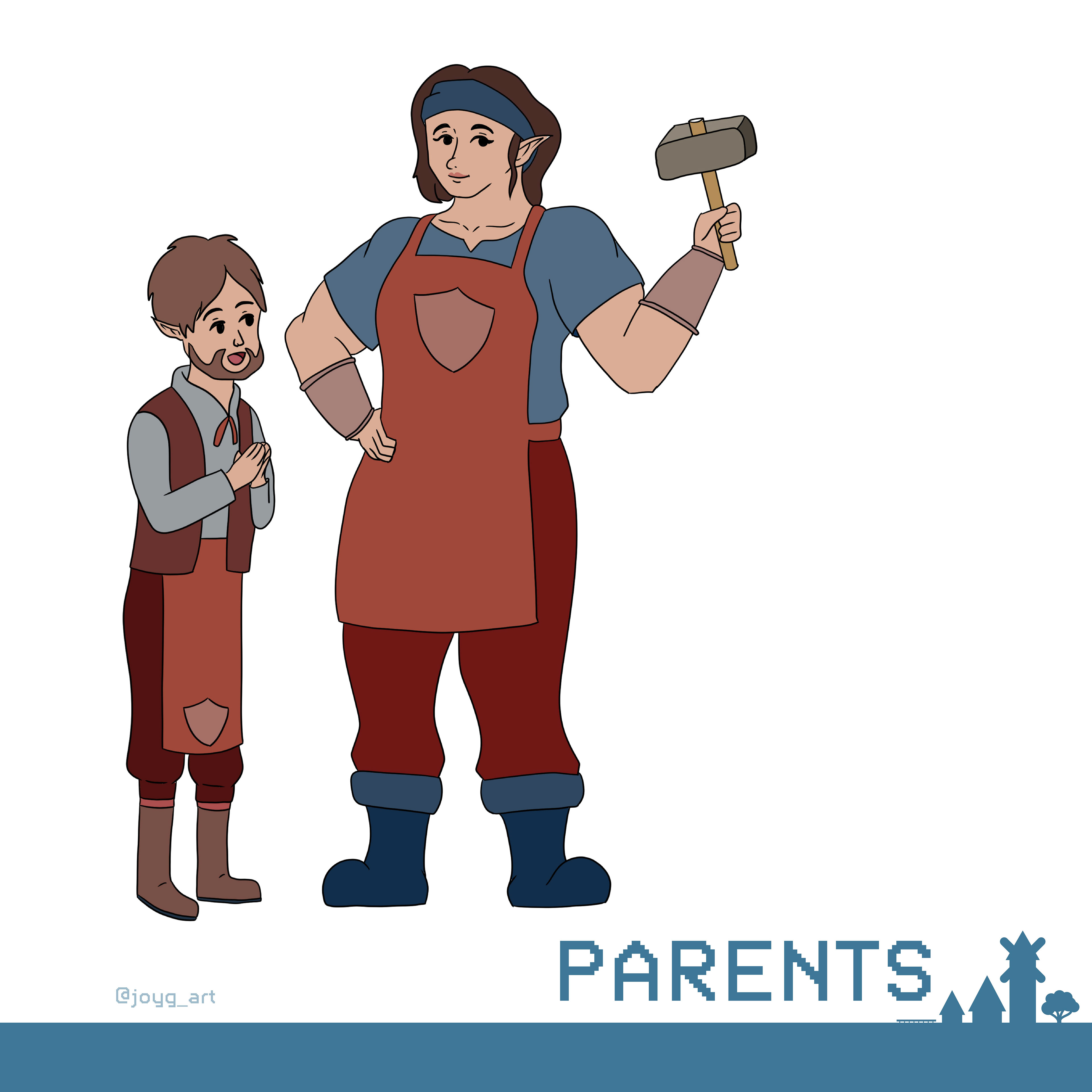
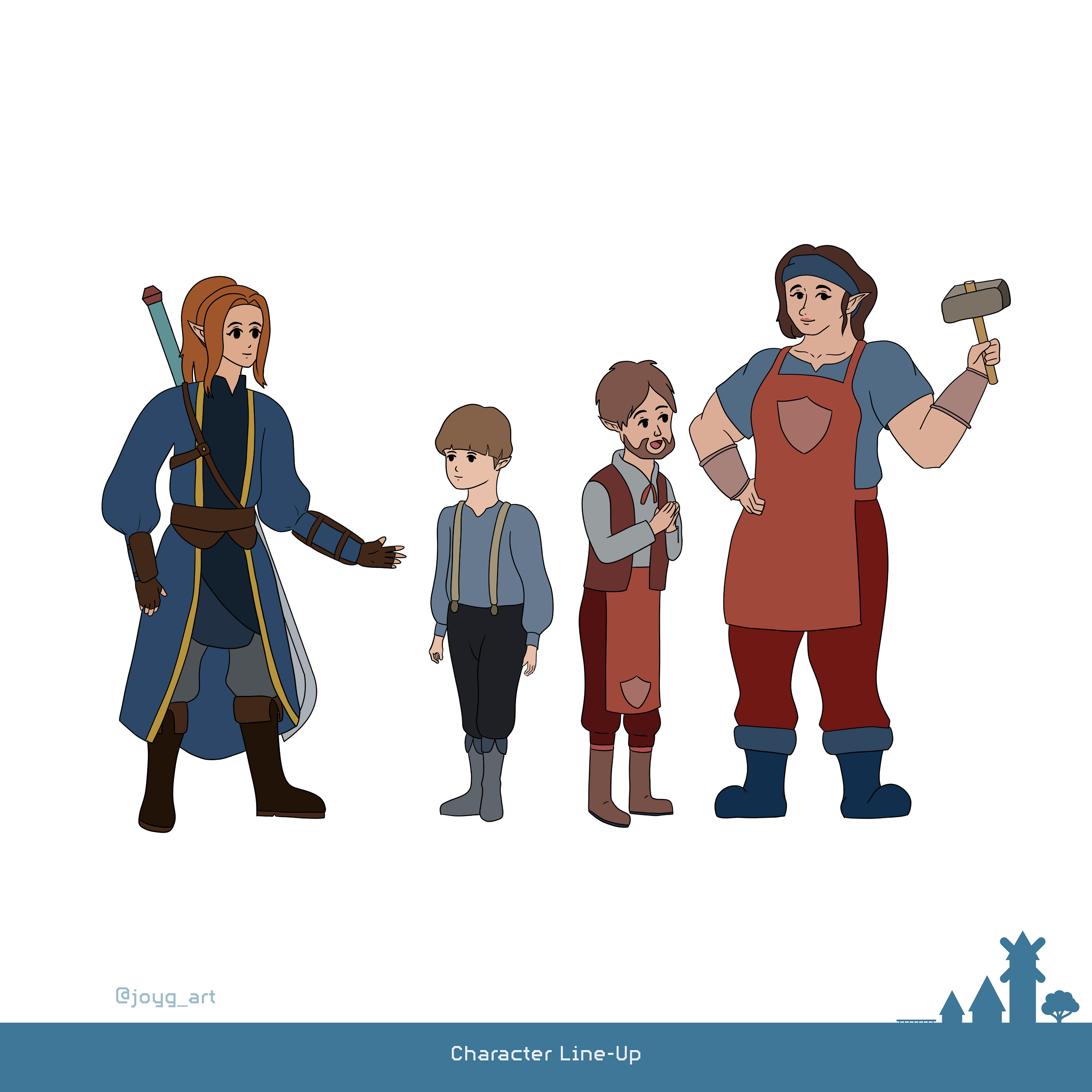
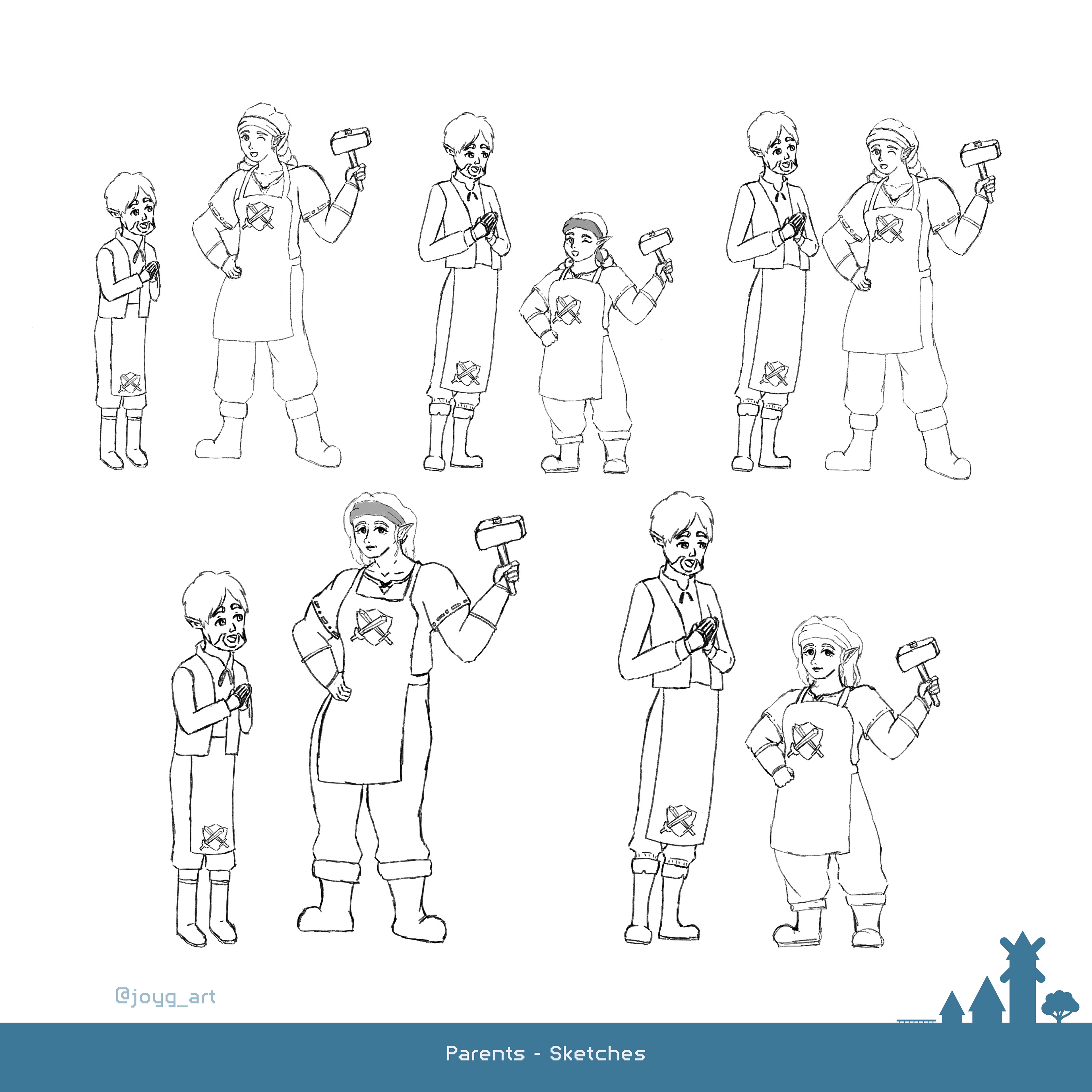
For the parents, who are the total opposite of the unimportant NPC while being the Blacksmith of the village, I wanted to play with their body sizes. Also I wanted to confront the stereotypical representation from each gender.
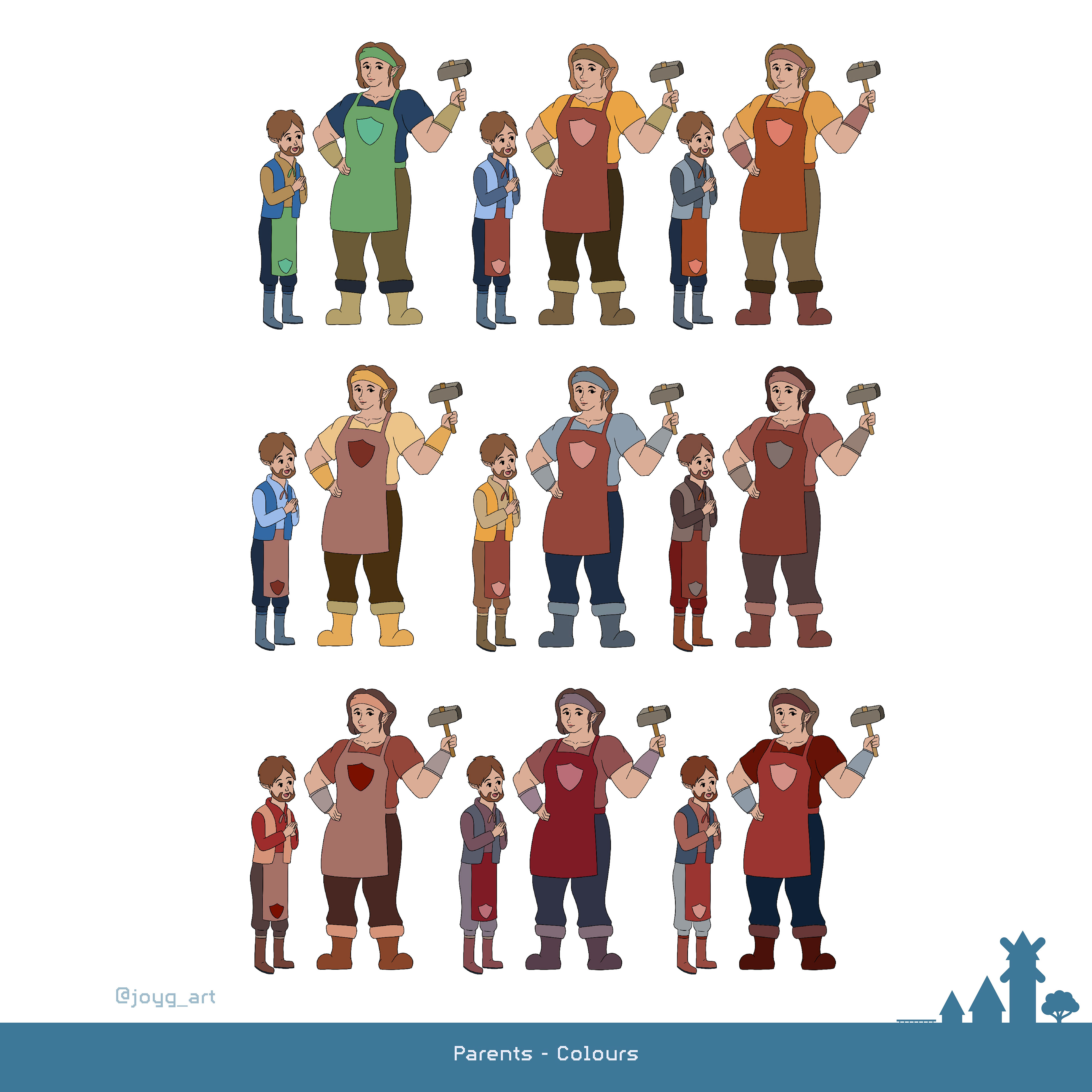
The parents should have similiar colours as the NPC. However, with the Red they would have a colour of their own which makes them even special.
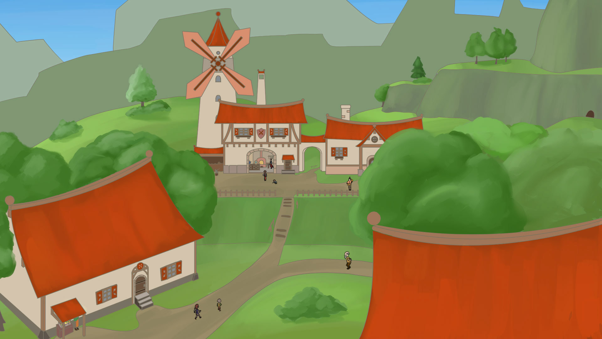
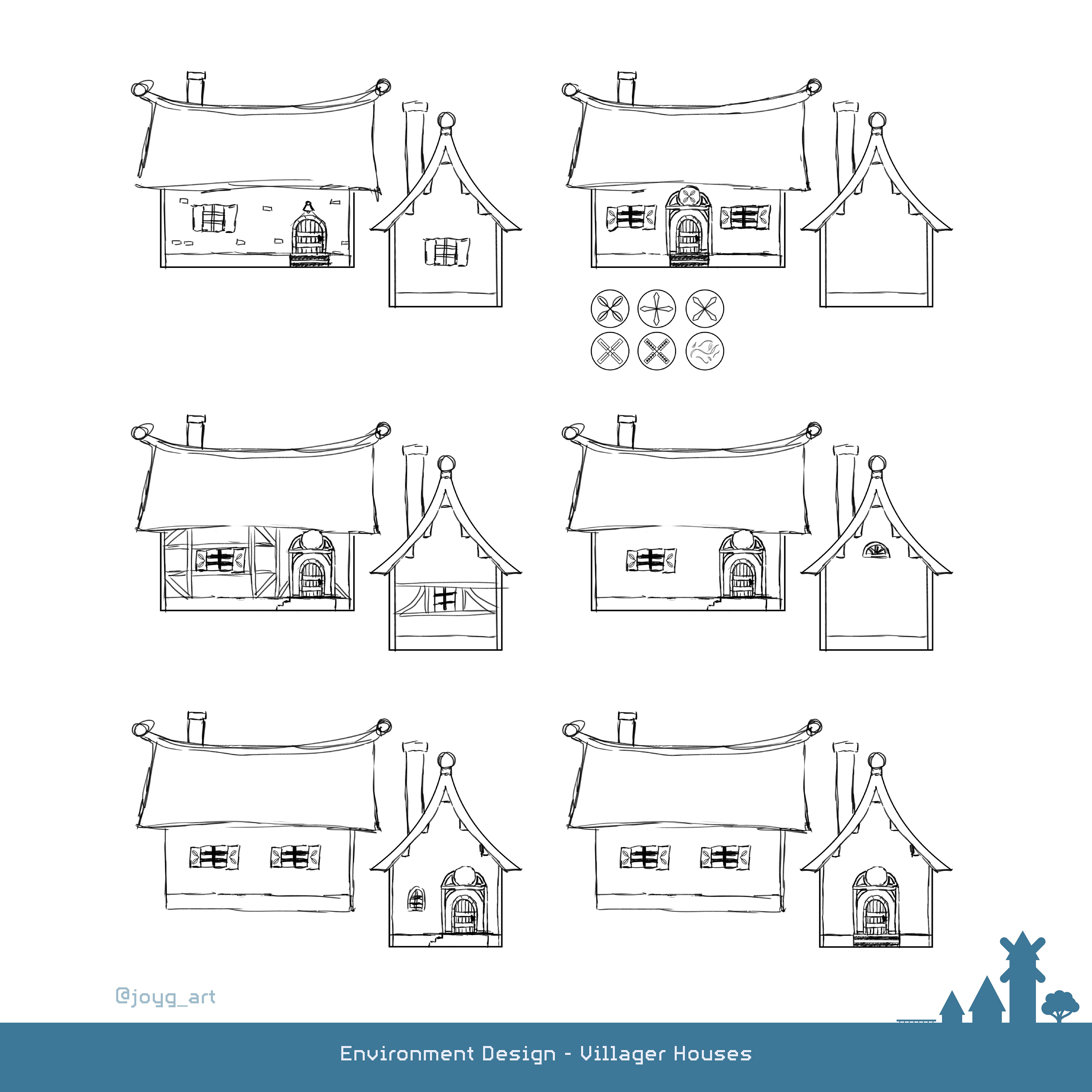
Blacksmith's House
[Clip Studio Paint | Master Semester 03/04 | 2024/2025]
[Clip Studio Paint | Master Semester 03/04 | 2024/2025]
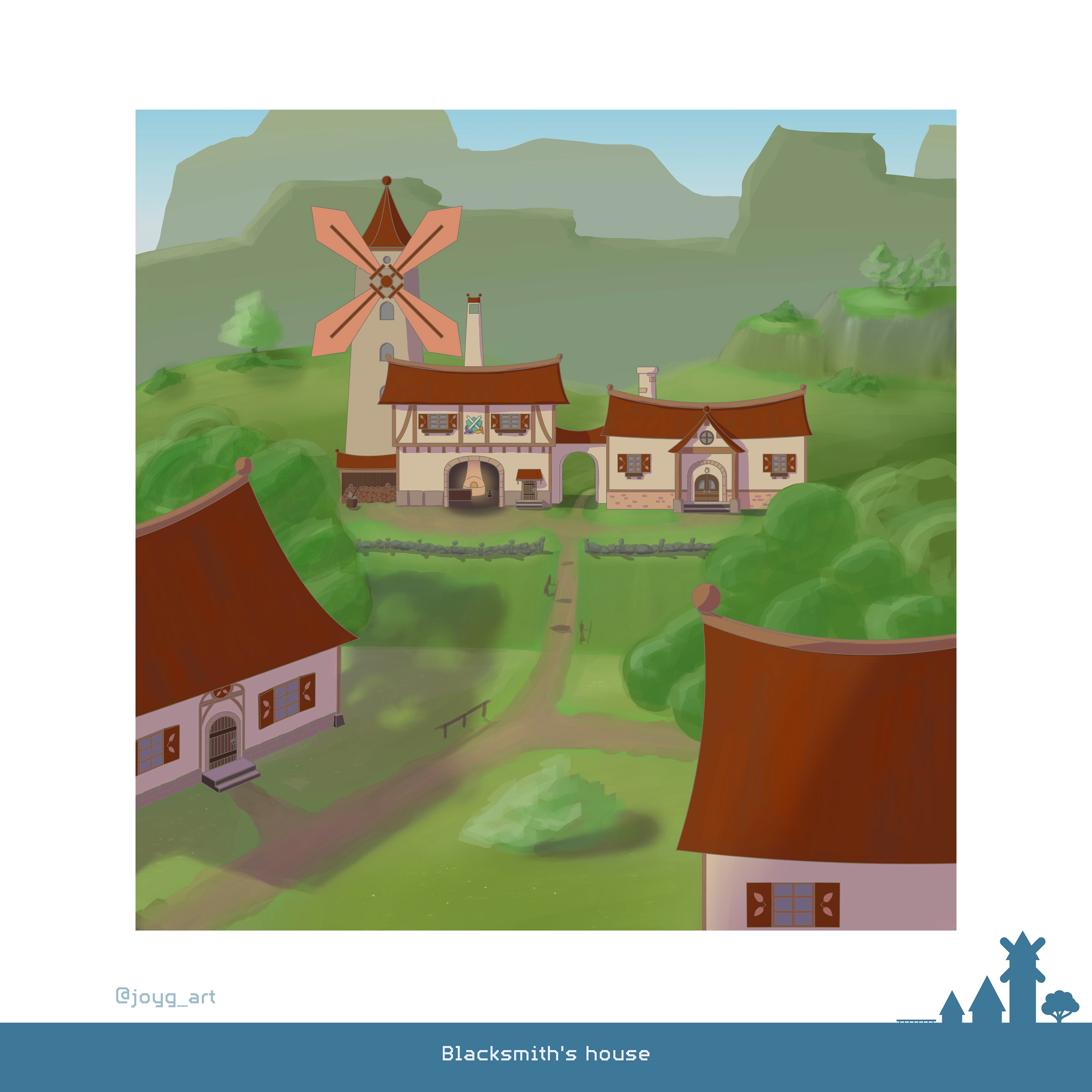
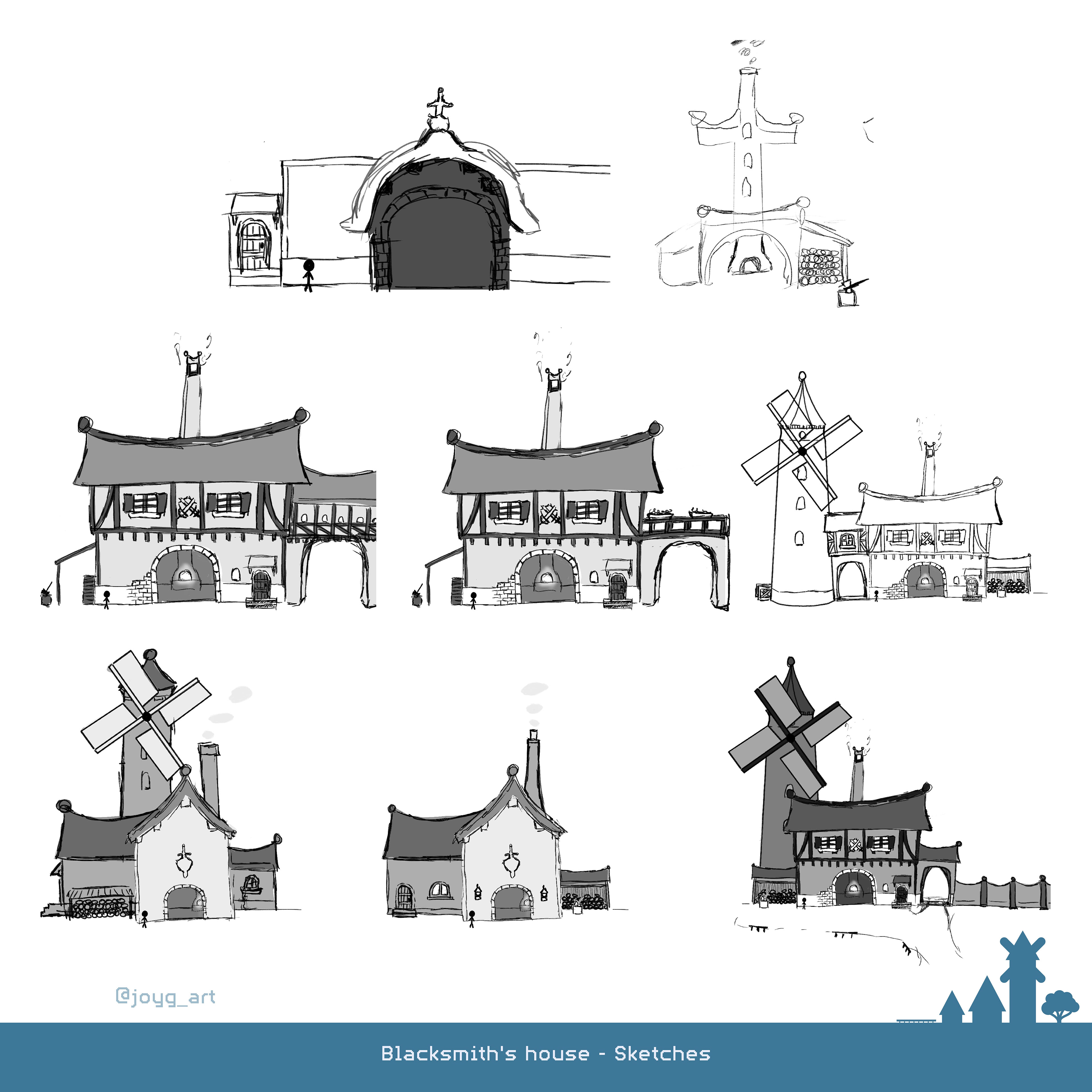
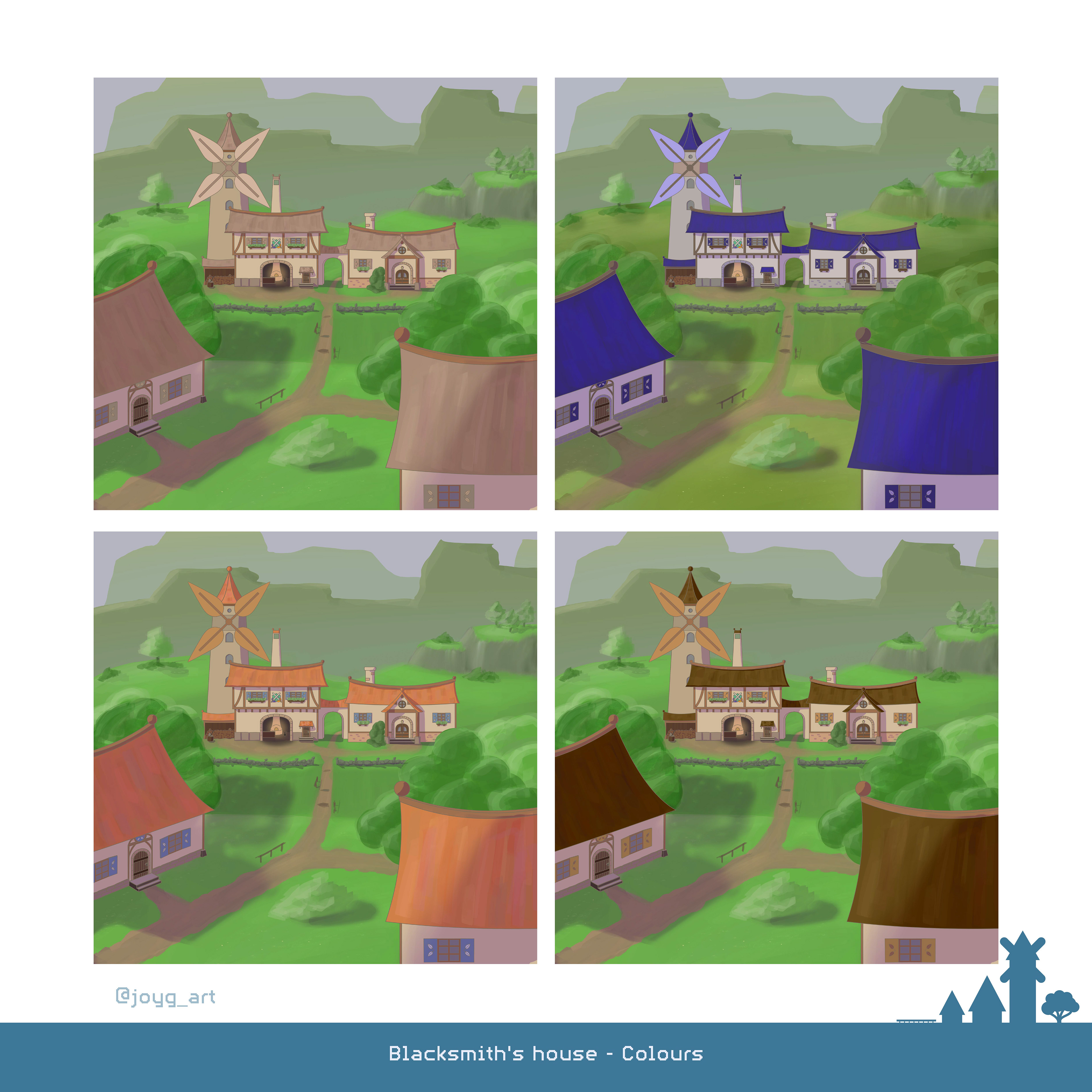
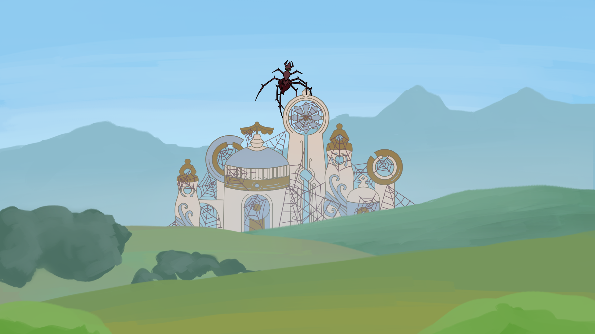
Wind Turbines played a huge part in the Design Process...
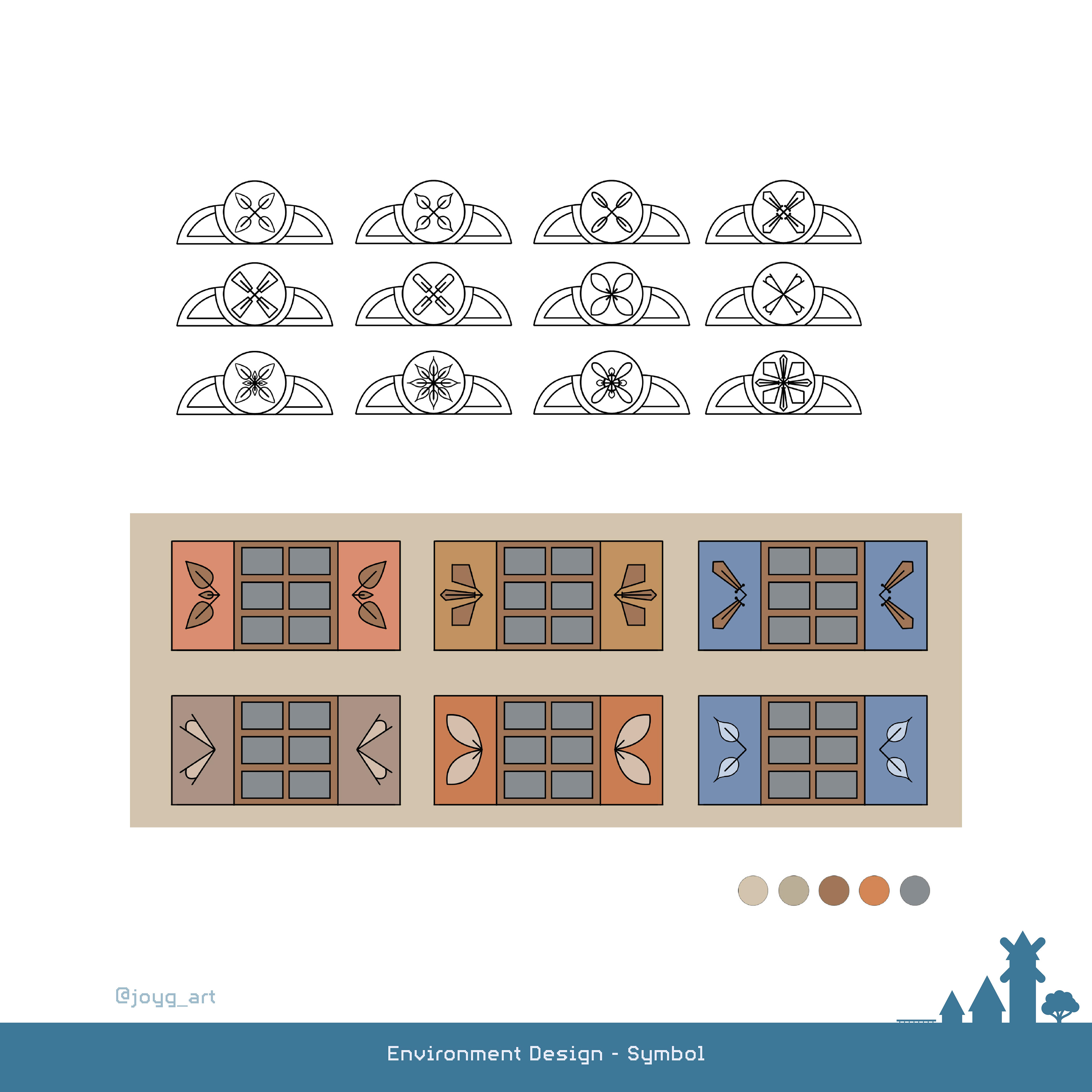
...because they were supposed to represent the whole village.
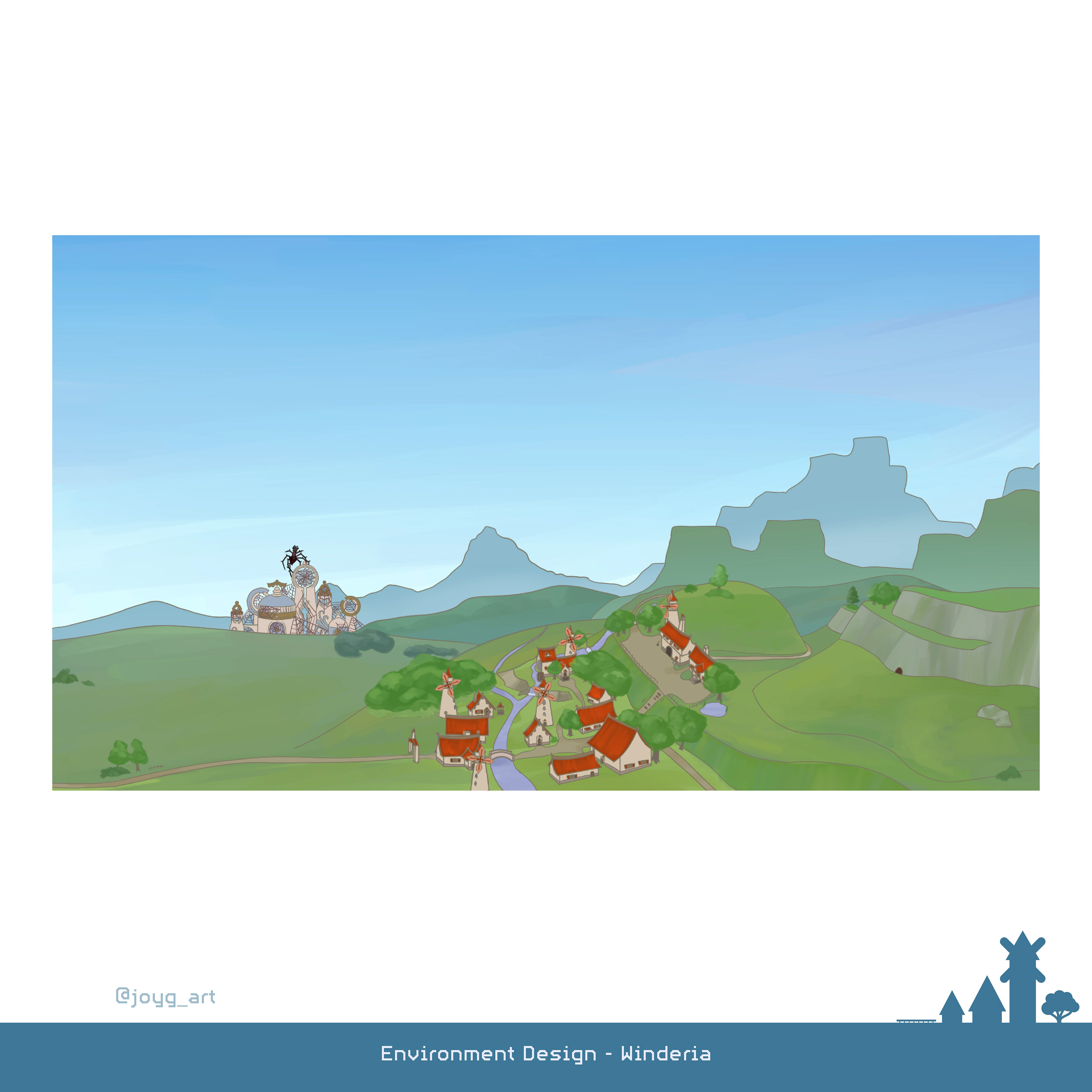
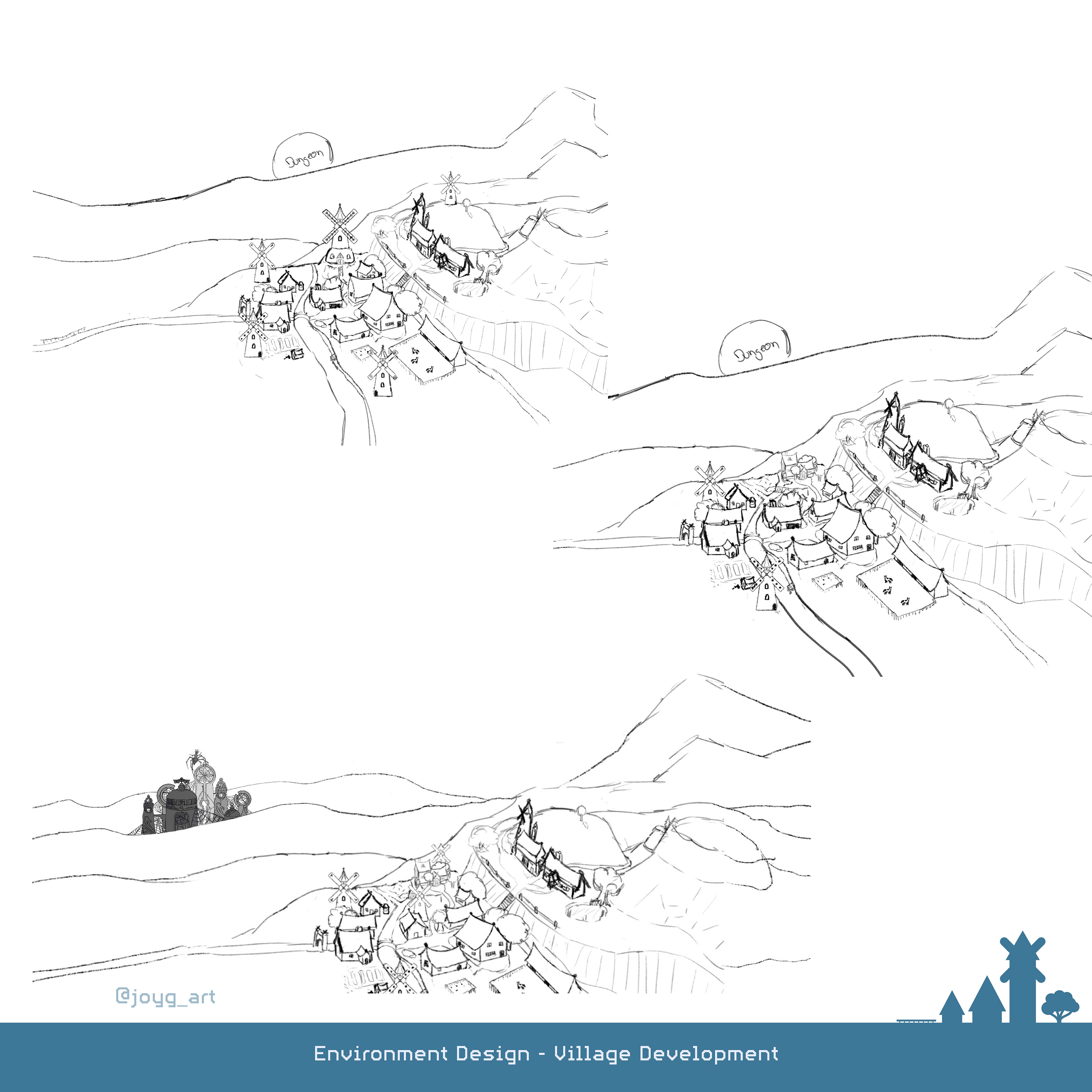
I tried to design a typical Game World. It was also important to clearly see the Dungeon.
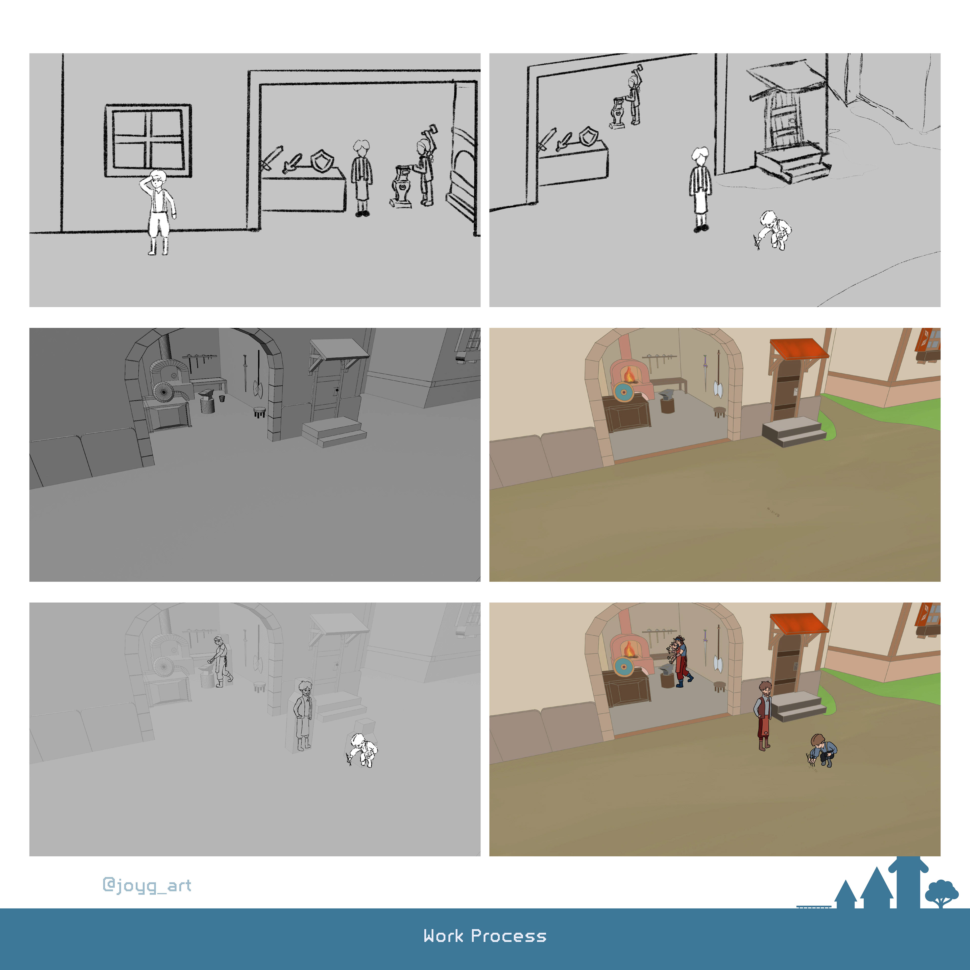
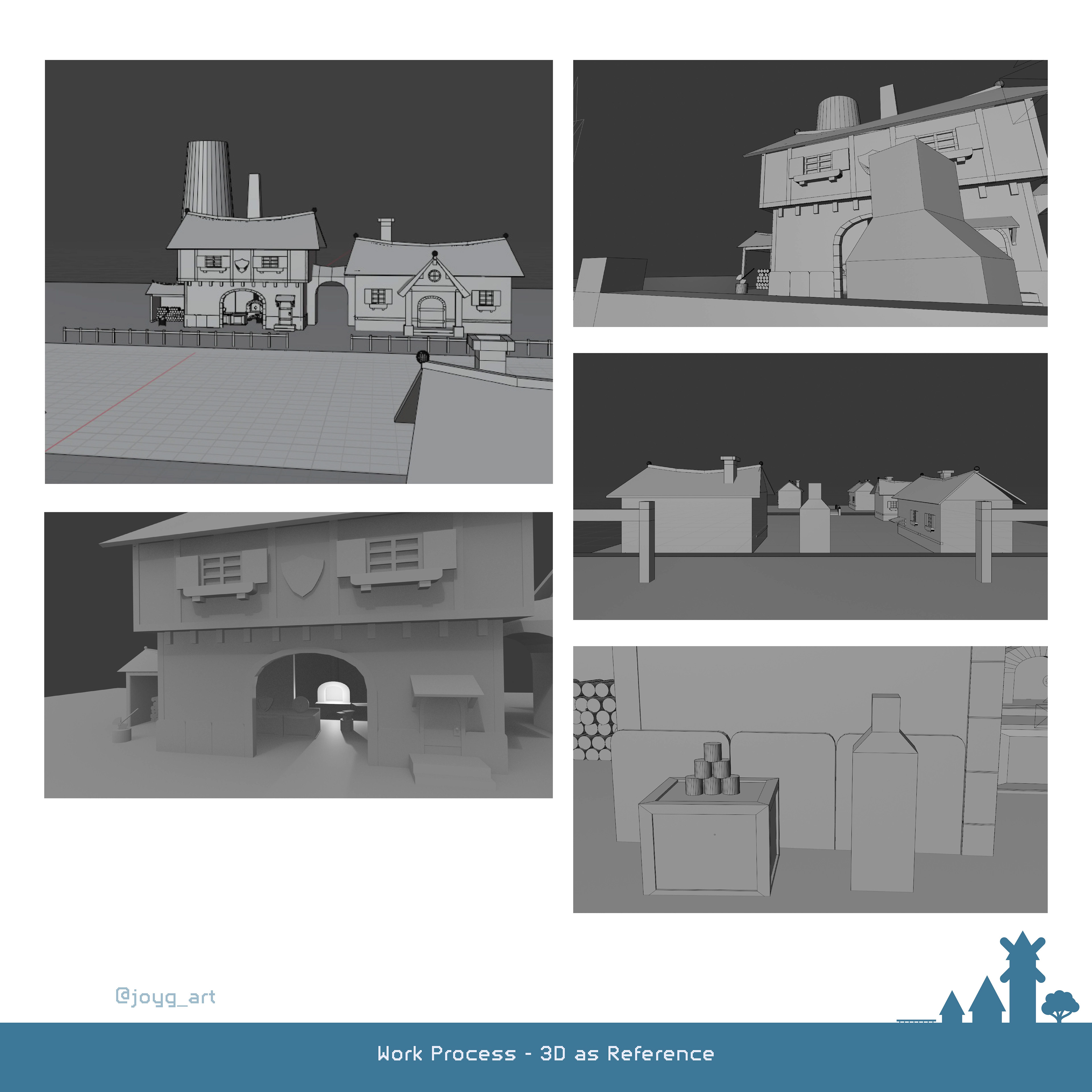
Work Process
[Clip Studio Paint | Master Semester 04 | 2025]
[Clip Studio Paint | Master Semester 04 | 2025]
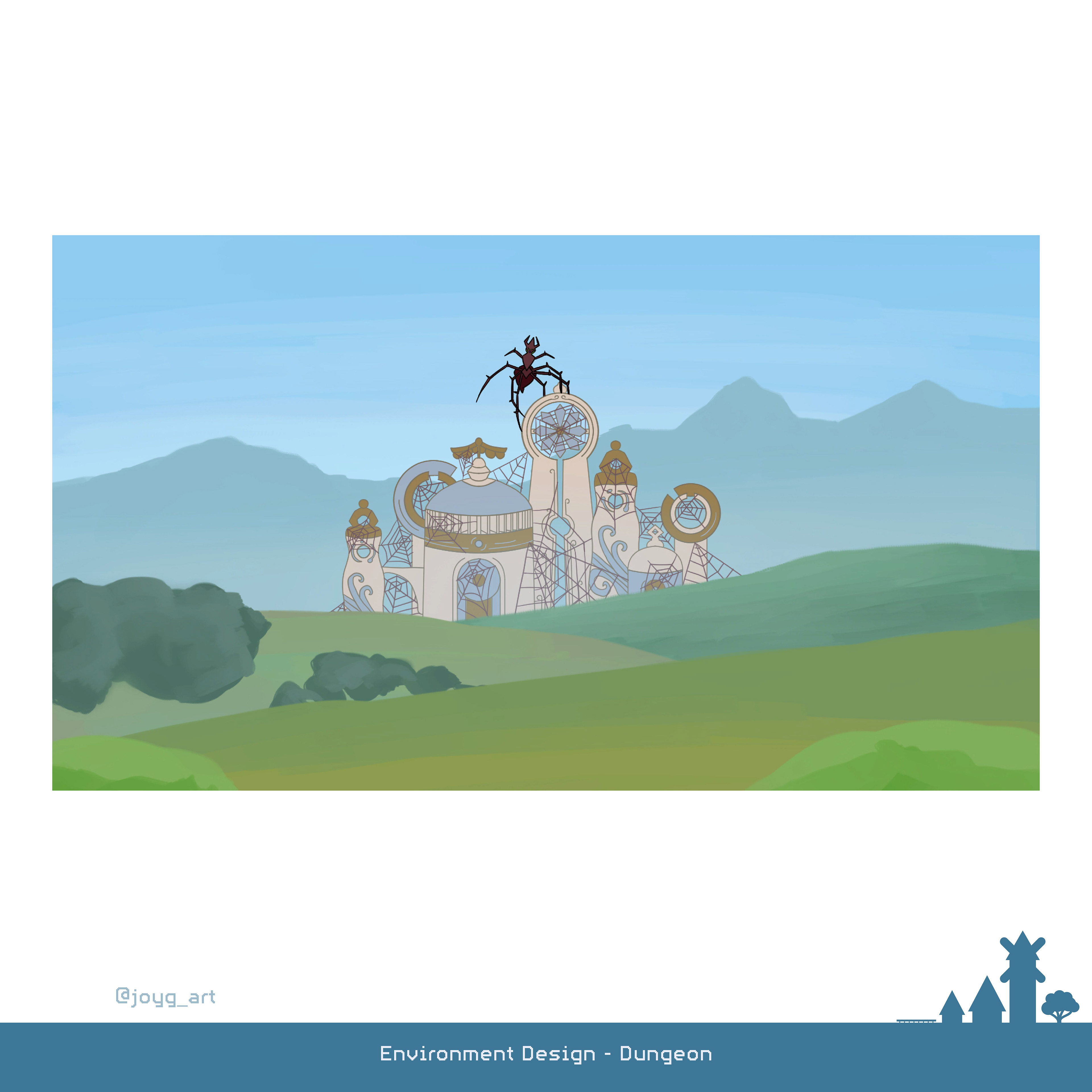
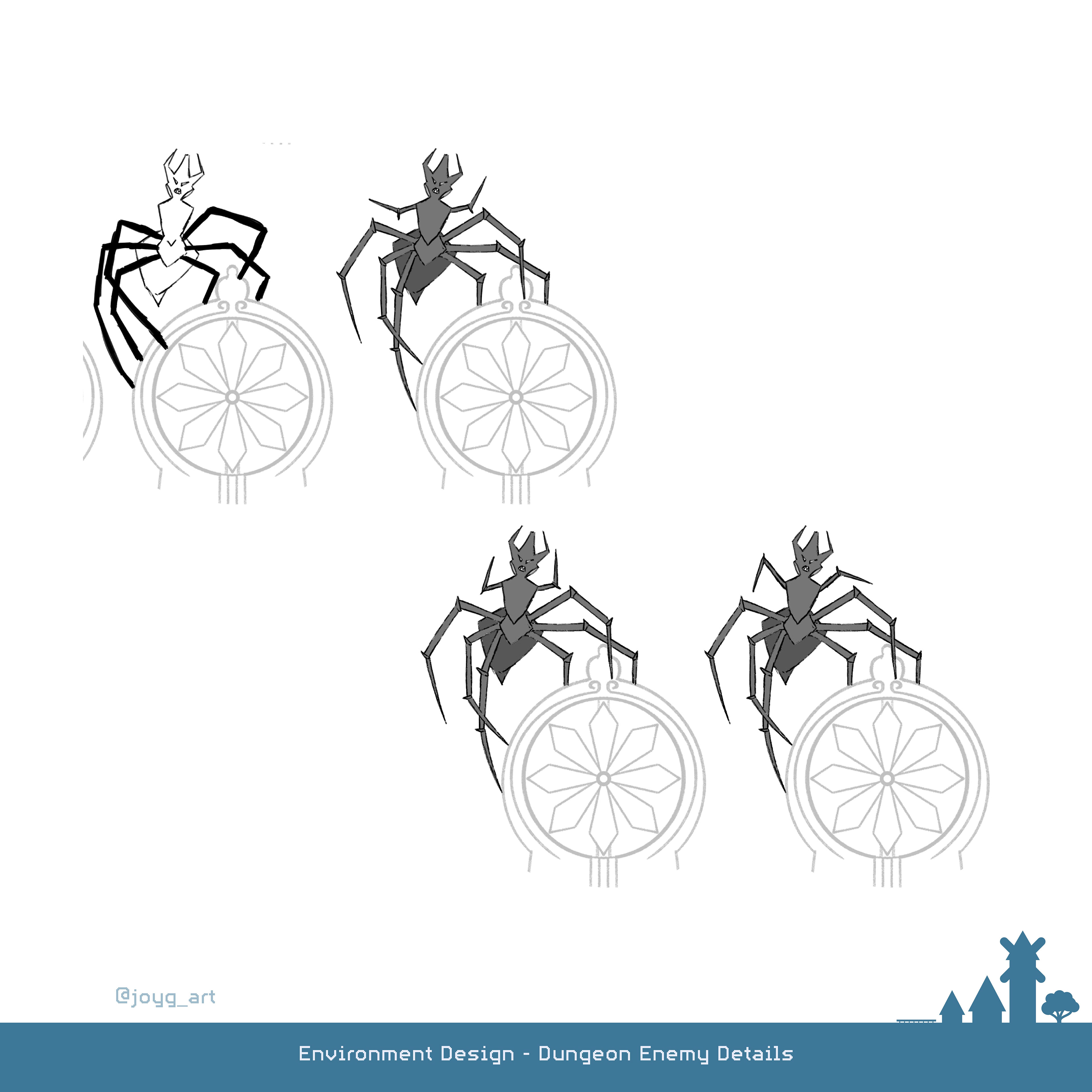
Dungeon
[Clip Studio Paint | Master Semester 04 | 2025]
[Clip Studio Paint | Master Semester 04 | 2025]
The whole Story around the Dungeon isn't the main focus of the Story. Because of that I had to find a way to clearly communicate the threat without having to explain anything or leaving the village. Therefore the village is full with wind mills that don't turn around because of the missing wind..
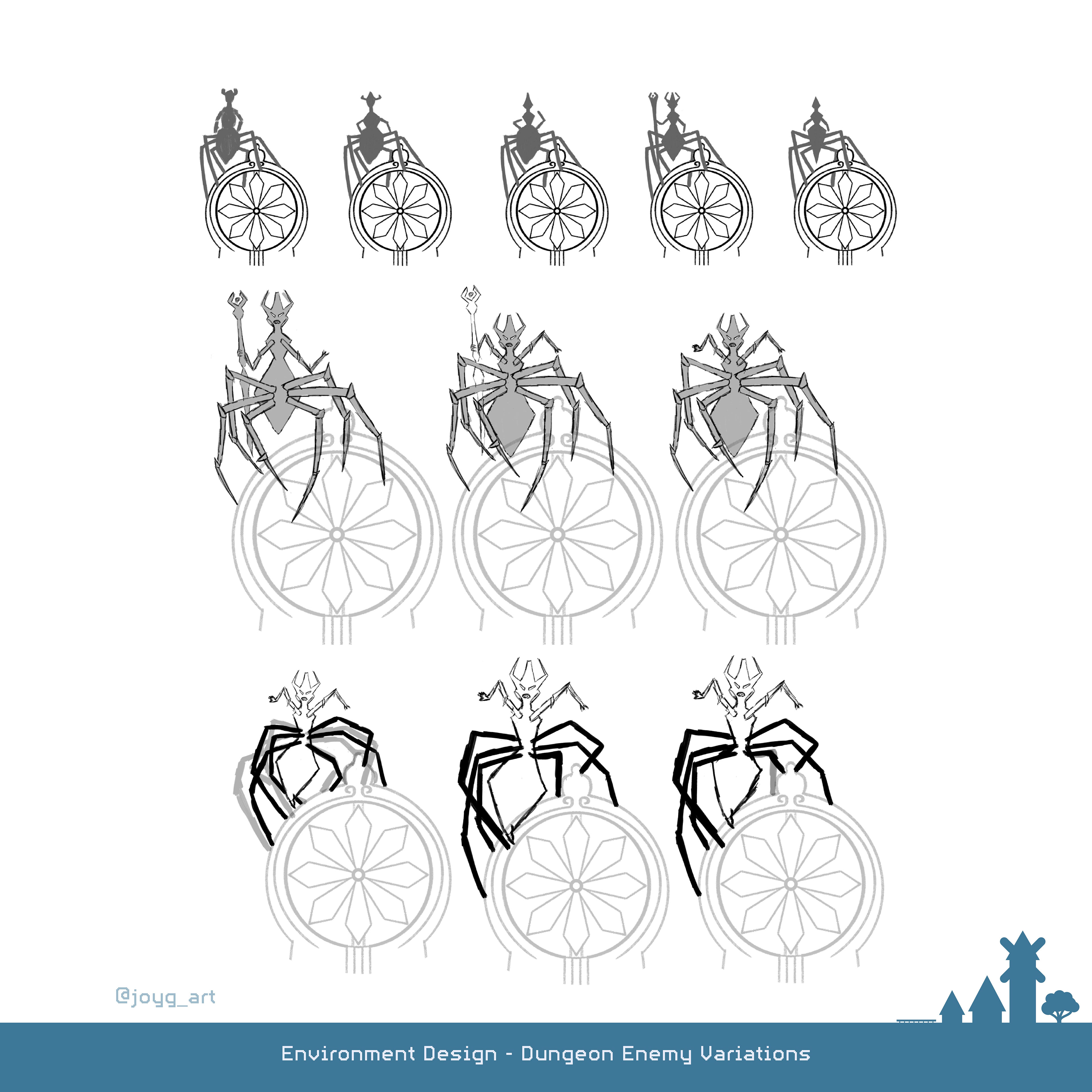
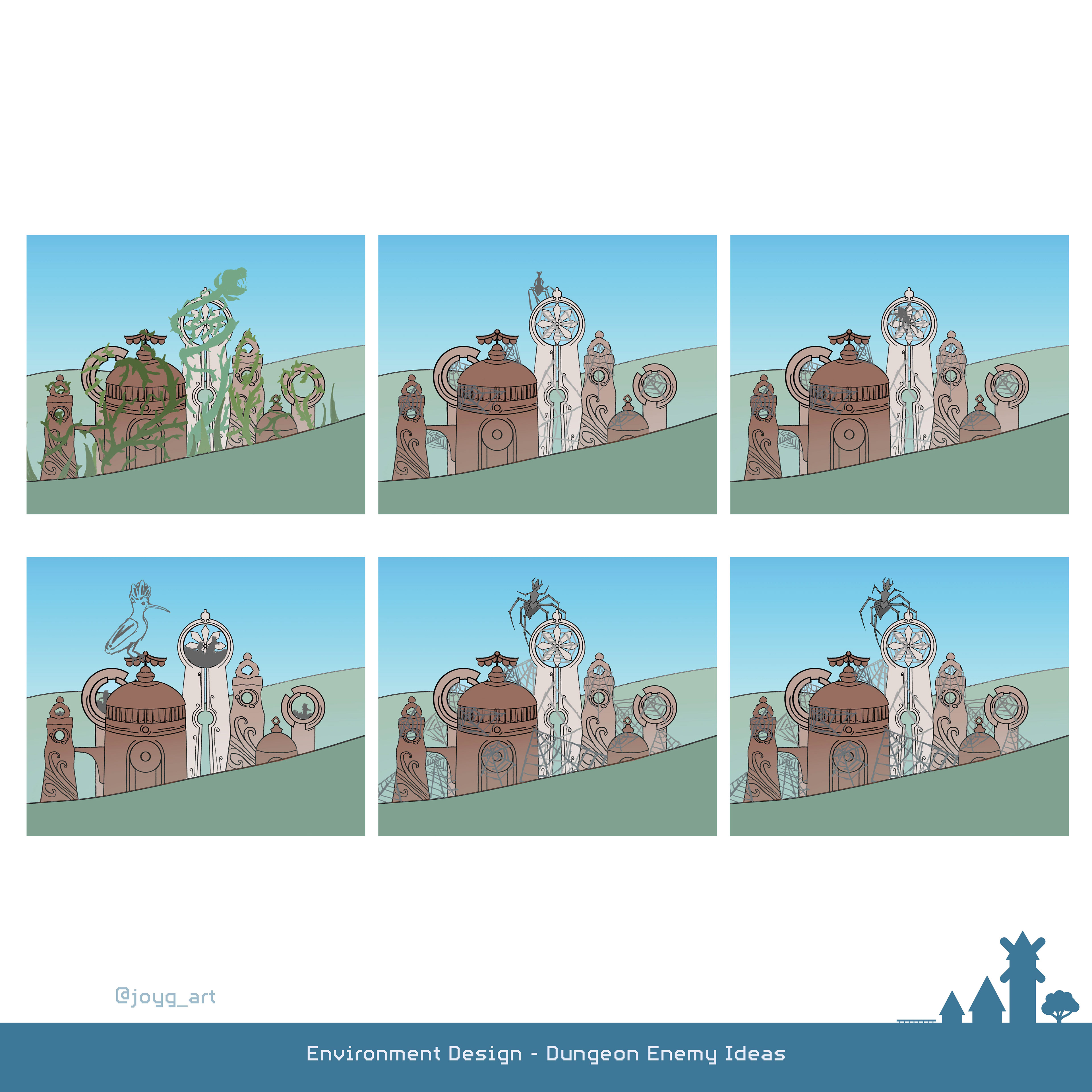
Moreover the enemy is a big spider which sits on top of the dungeon and looks threatening to the village.
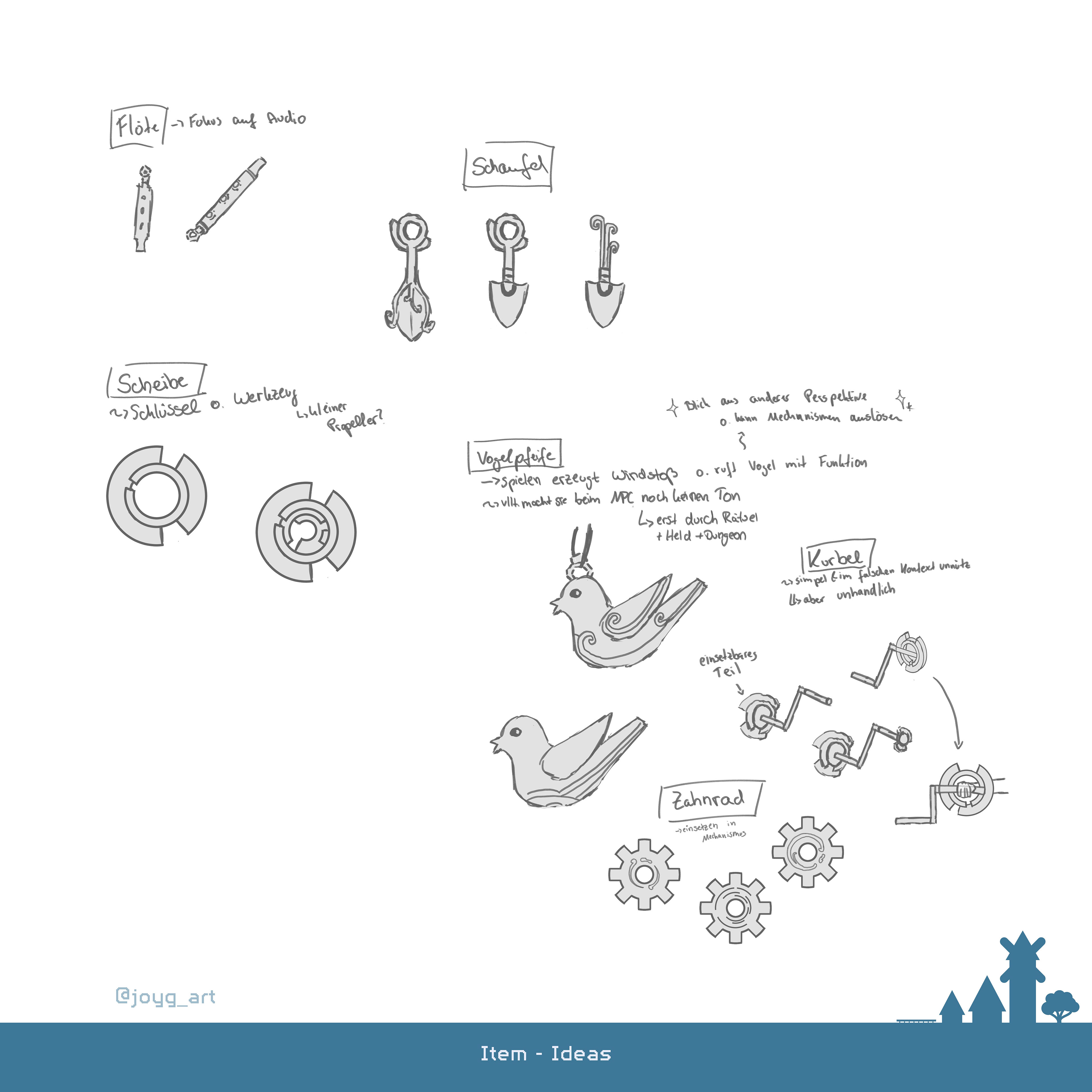
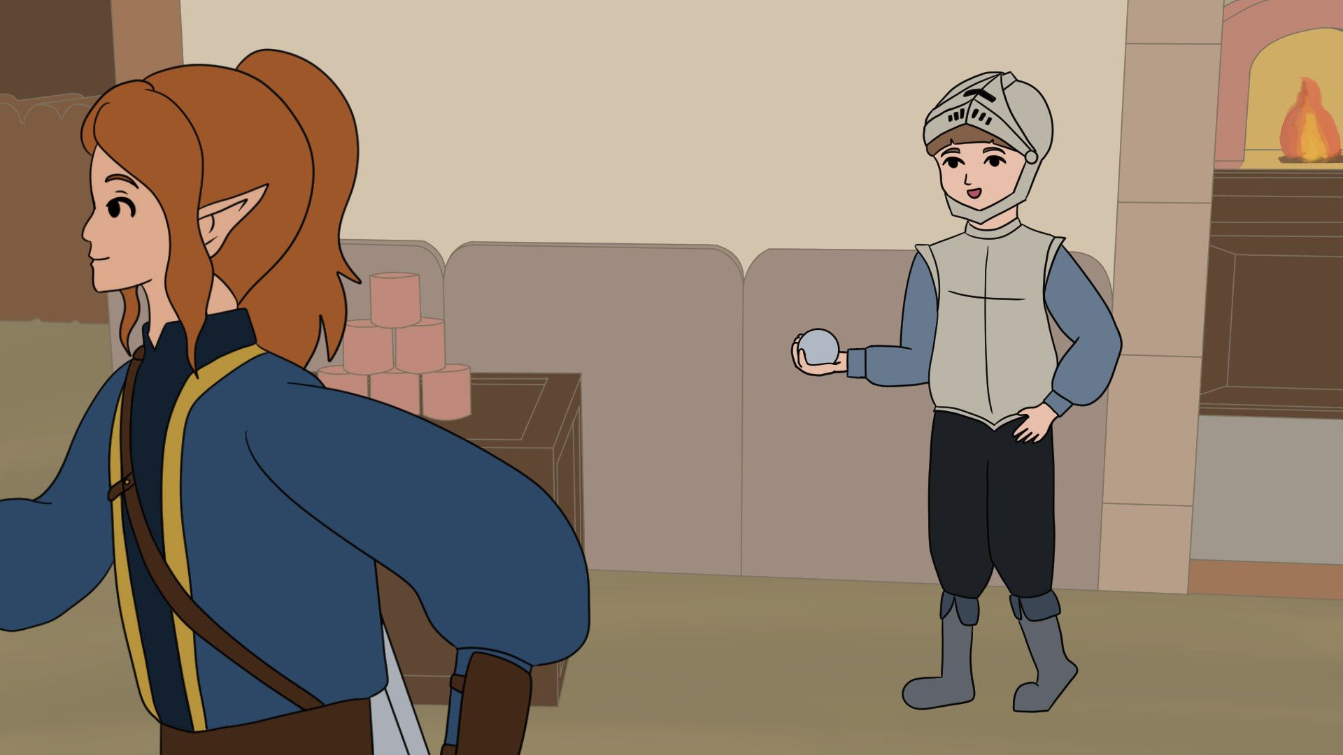
The NPC wants to help the Heroine but only has an item that has no use...or so he thinks.
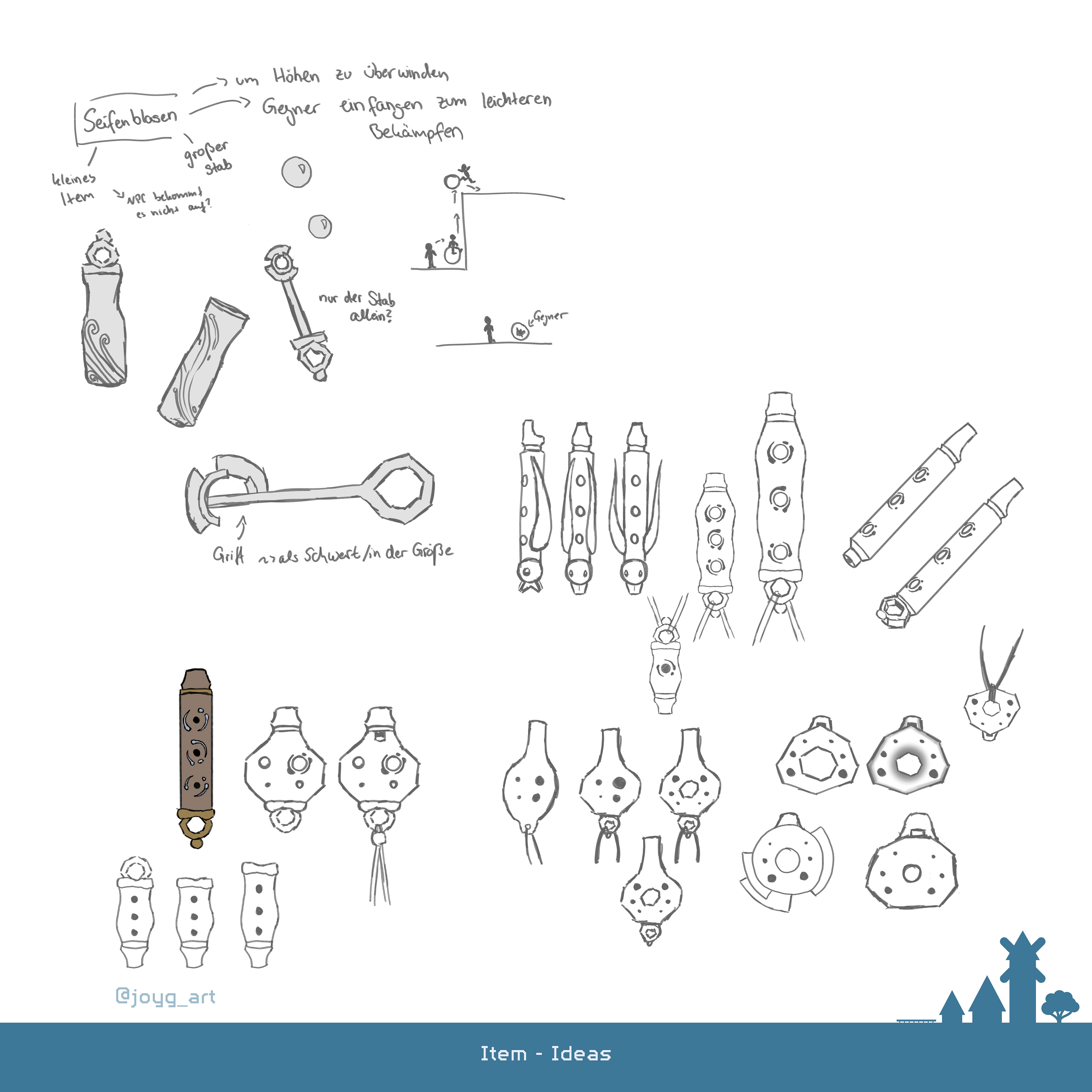
It was a big challange to find an item that seems useless for the one and usefull for the other with the context of the world. At the end I chose a flute which was designed with the dungeon look in mind.
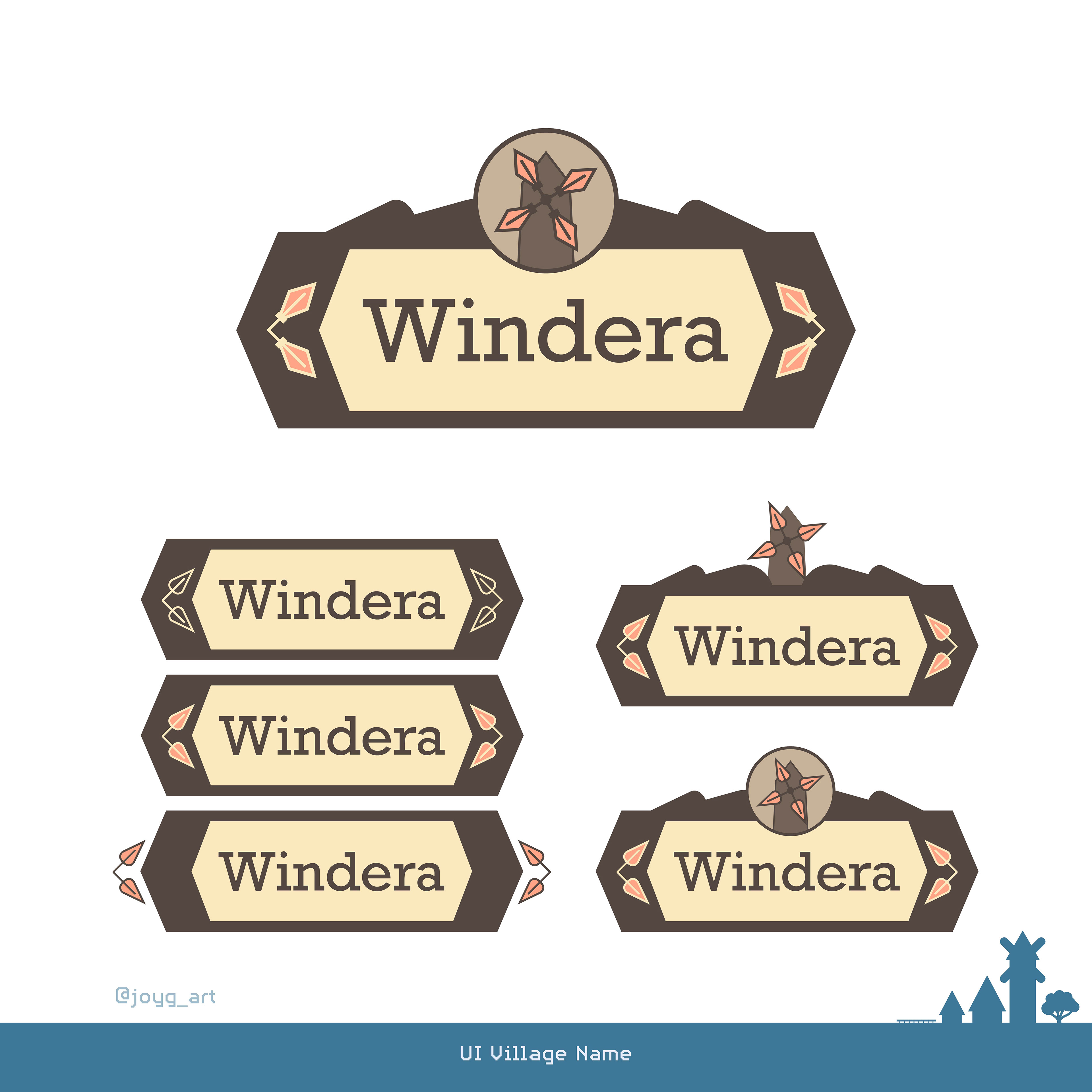
Logo
[Illustrator | Master Semester 04 | 2025]
[Illustrator | Master Semester 04 | 2025]
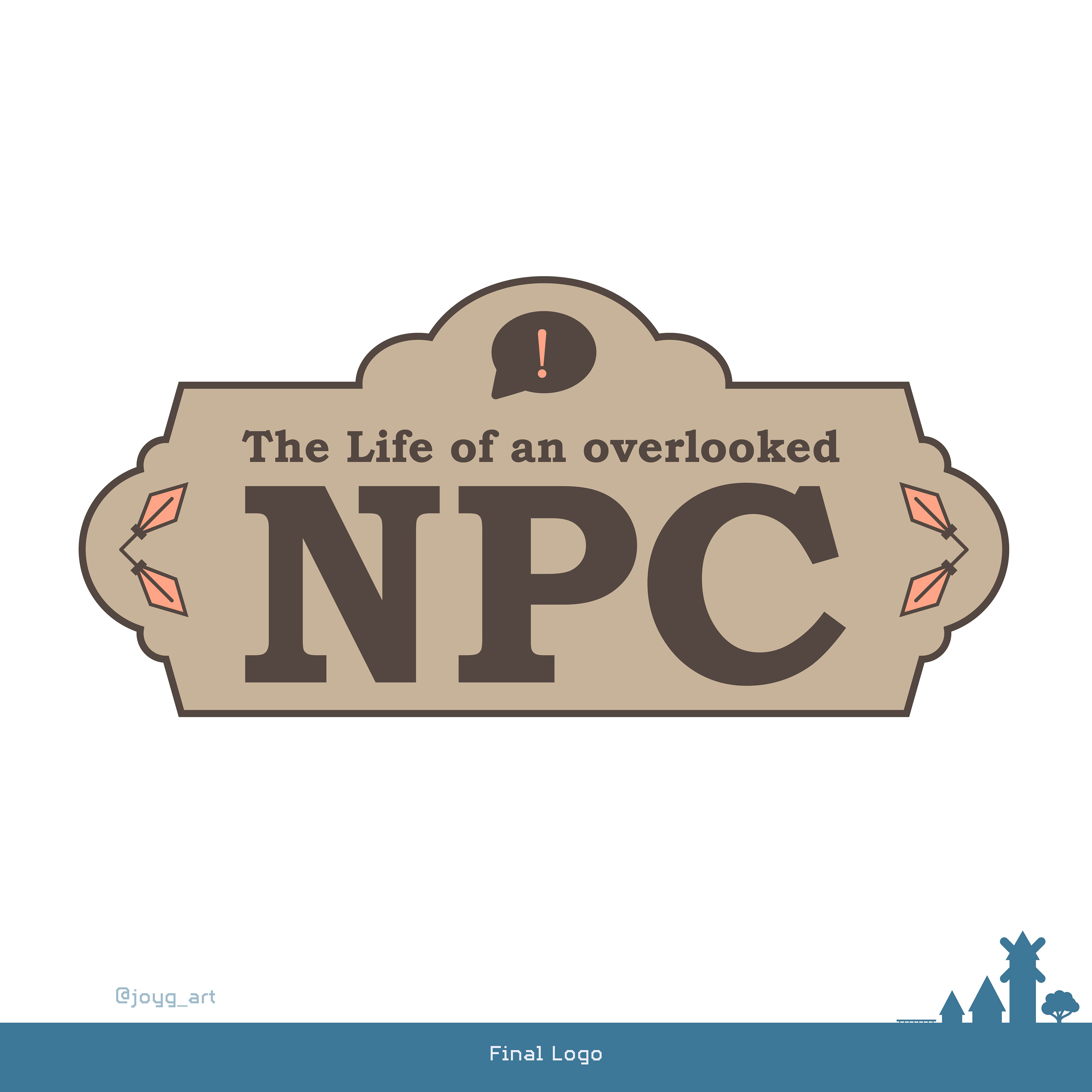
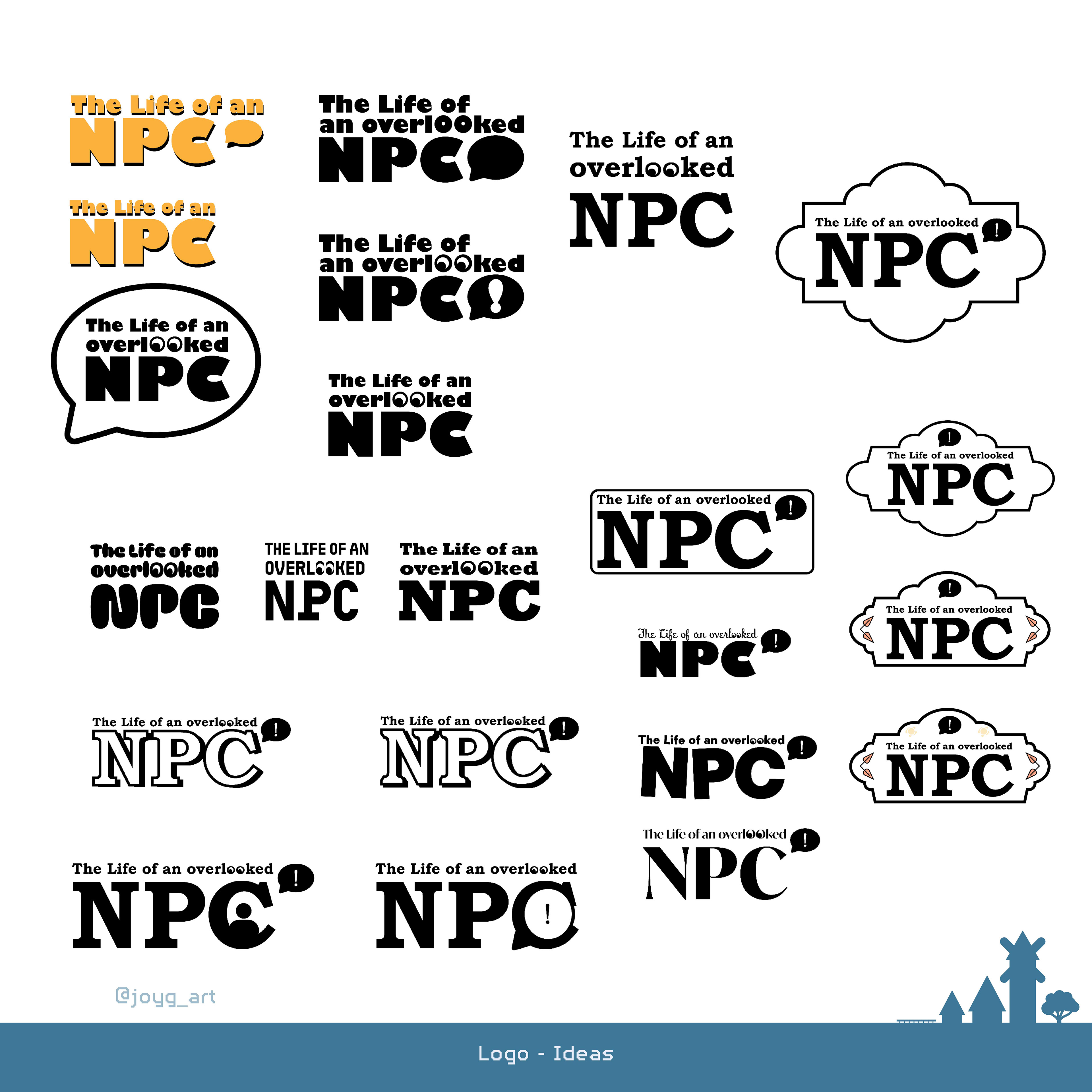
I really liked the minimalist and goofy approaches but they were not suitable for the game world.
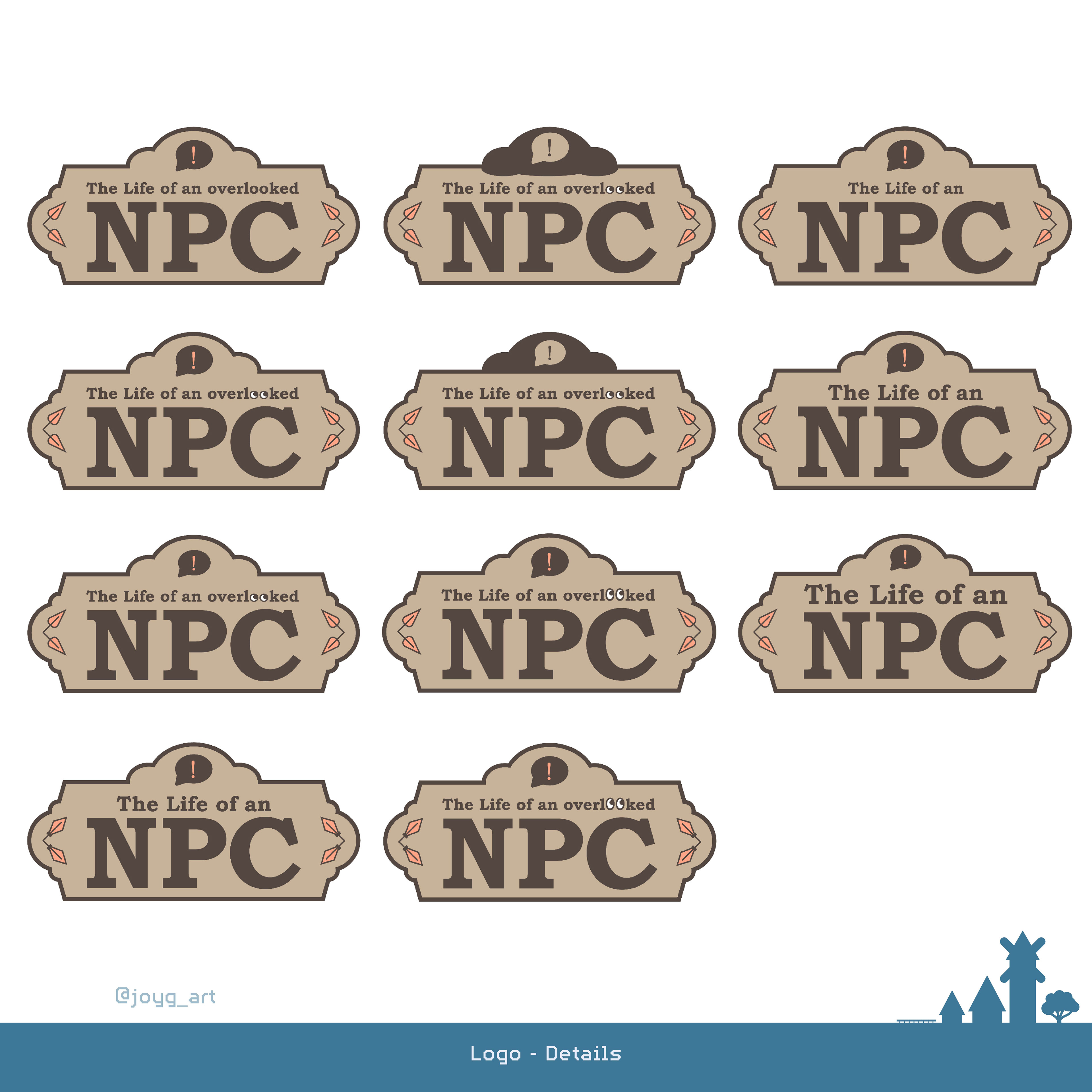
So I tried a more rustic look with a wooden town board.
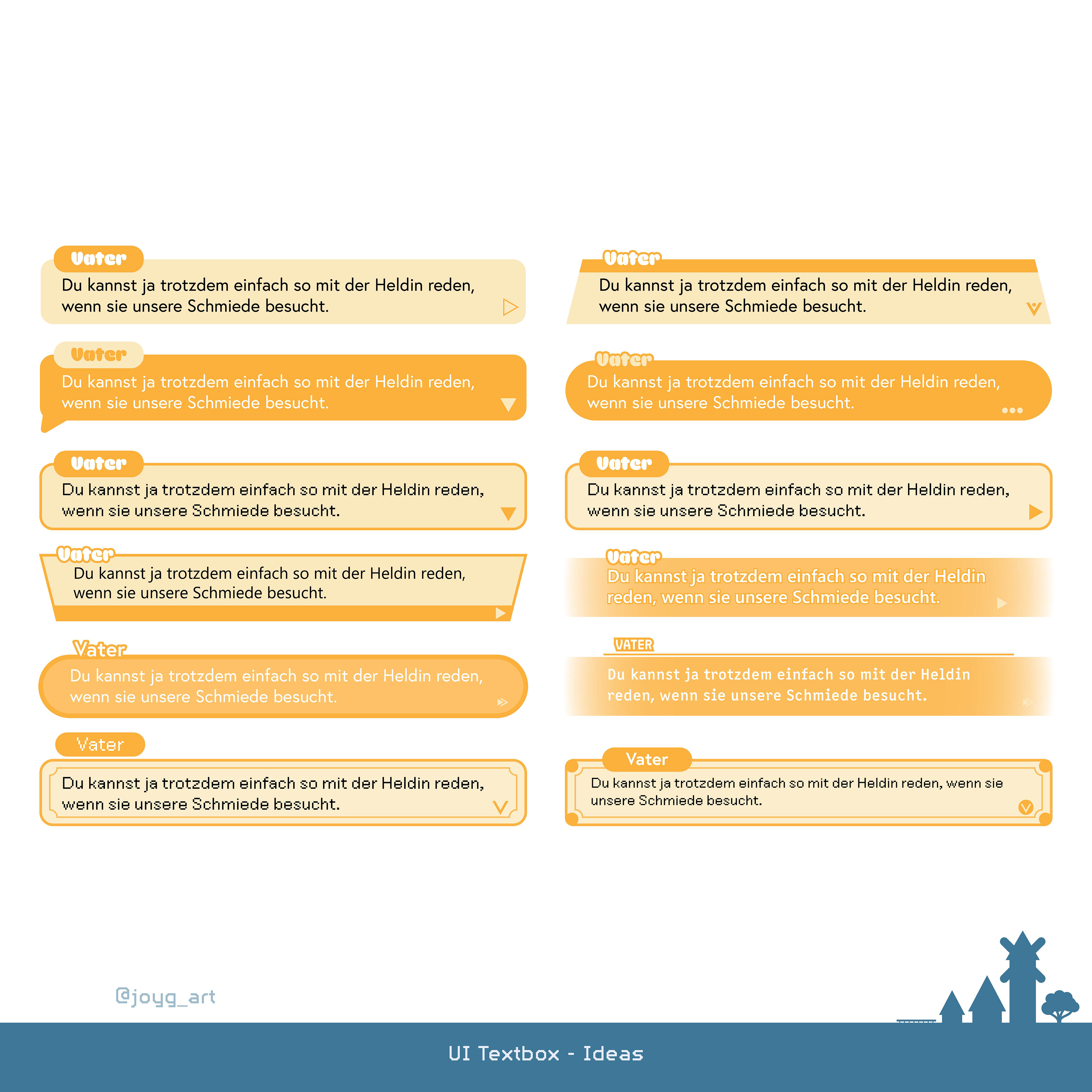
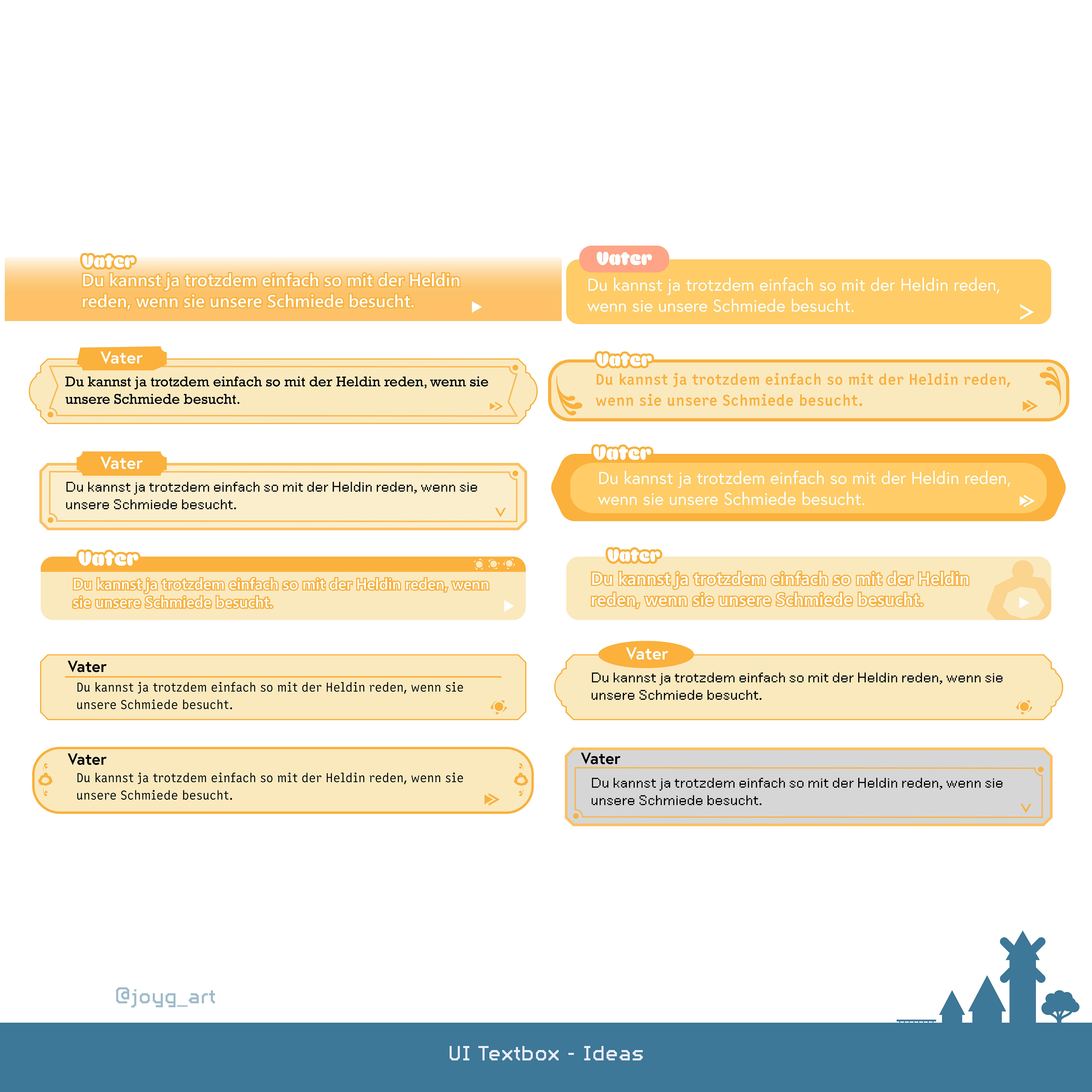
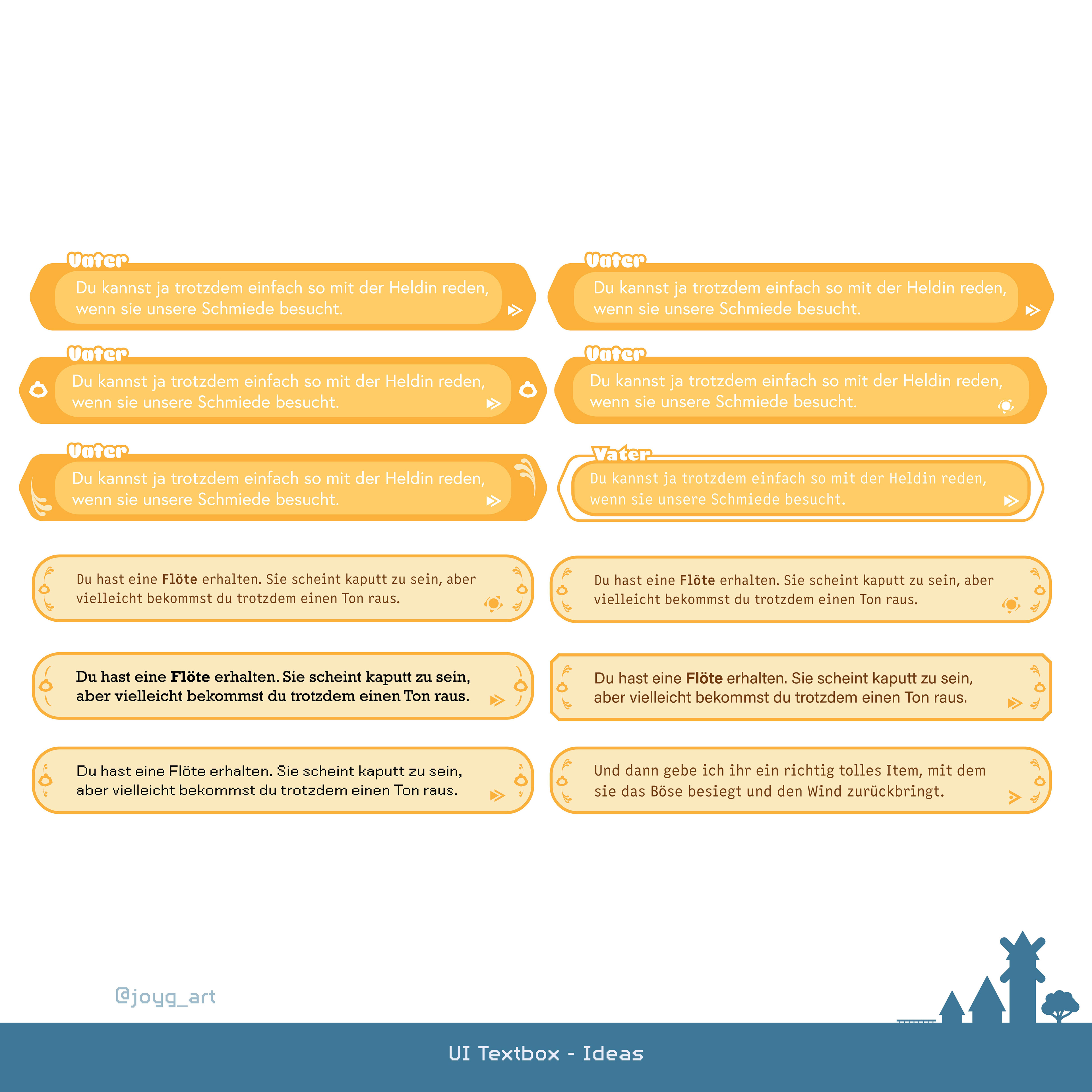
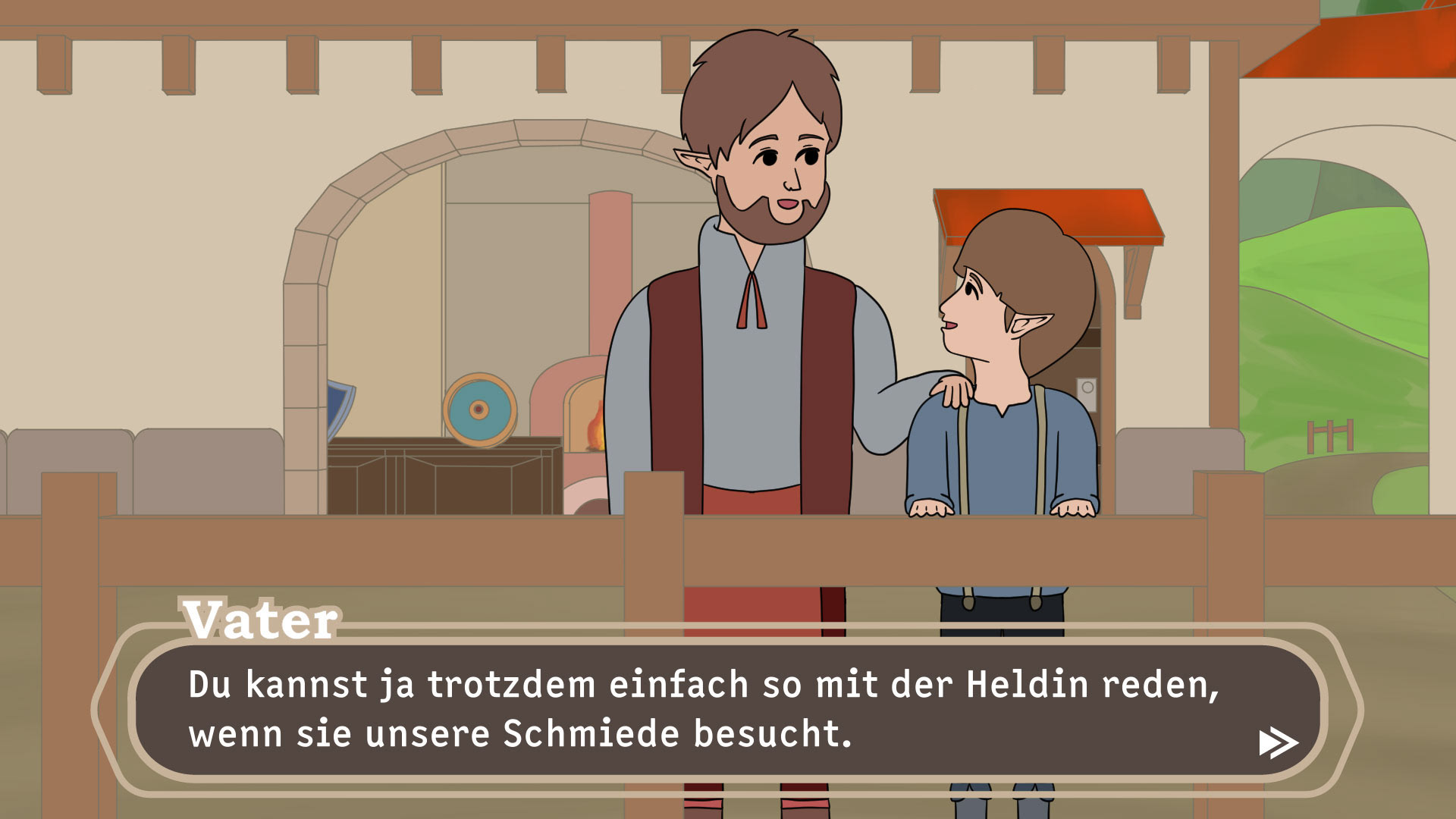
Various UI Designs
[Illustrator | Master Semester 04 | 2025]
[Illustrator | Master Semester 04 | 2025]
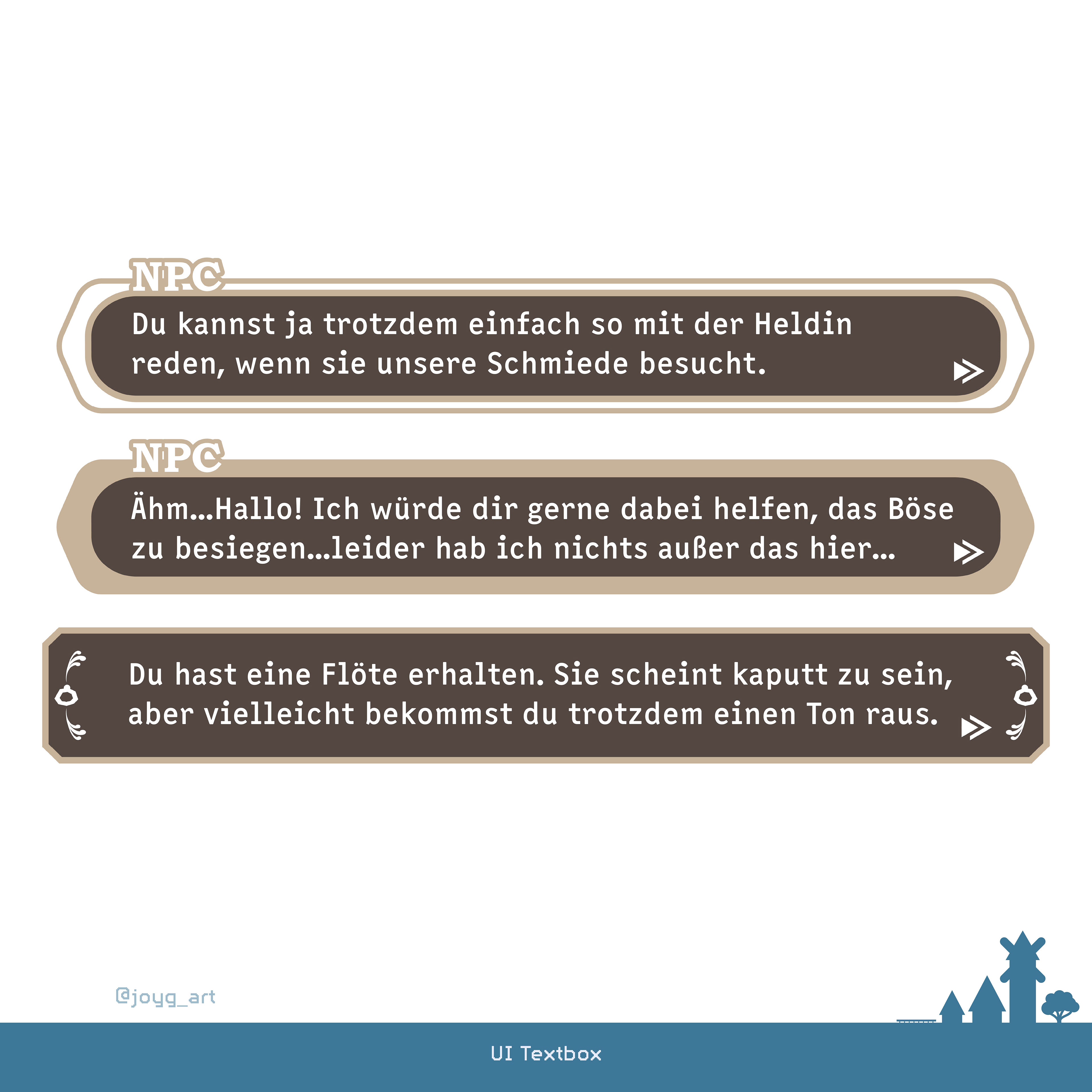
While the one on the top is used by the NPCs when they talk to each other the one in the middle is used when the heroine talks to someone. The one at the buttom appears when the heroine founds an item.